Archives: Projects

  • DIFC — Harnessing Local Talent campaign

    DIFC — Harnessing Local Talent campaign

    Dubai International Financial Centre

    Harnessing Local Talent campaign — 82% increase in leads

    ——

    Project overview

    DIFC wanted to support the UAE’s 2021 Vision of empowering local talent, supporting SMEs and promoting entrepreneurship within the country.

    ——

    What we did

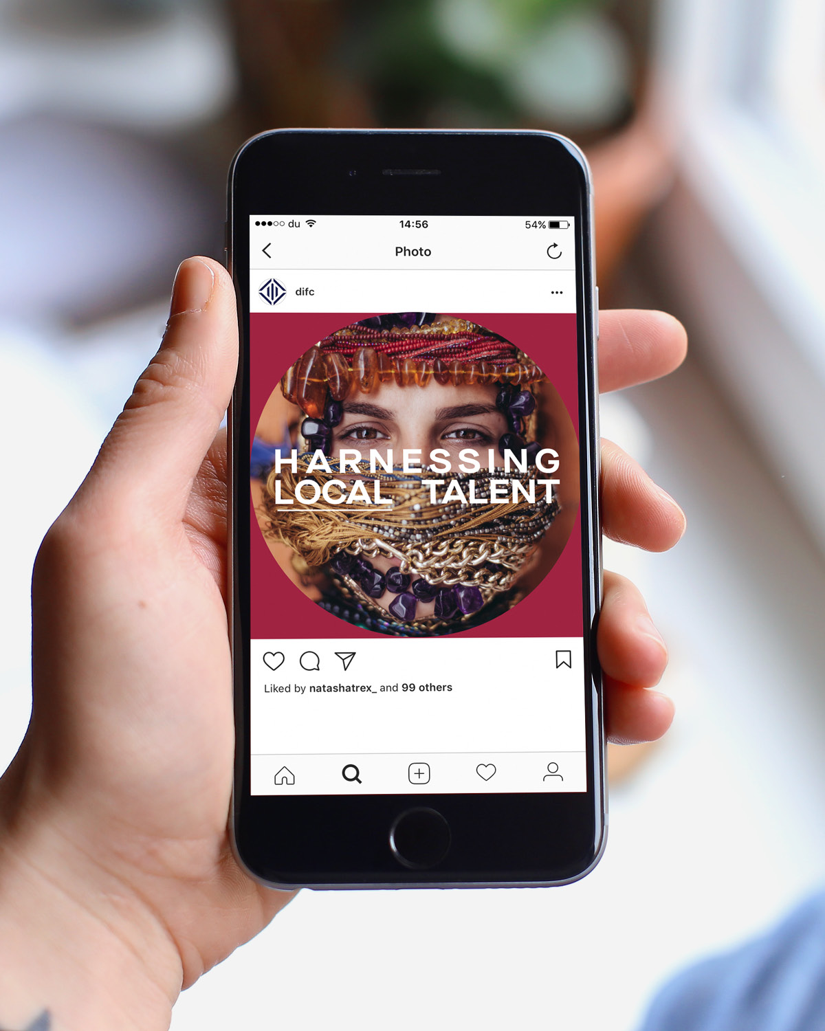
    Dragoman and the team at DIFC conceptualised the Harnessing Local Talent (HLT) competition. A national campaign aiming to attract local designers and homegrown brands, with the winners given the opportunity to set up a retail presence in The Design House, DIFC’s dedicated space for SMEs.

    Dragoman worked on the communication architecture and endorsement strategy, recommending that the HLT competition be linked back to the DIFC masterbrand. This enhanced DIFC reputation for supporting entrepreneurial talent and fostering creativity.

    The campaign ran across paid digital, social media, print, PR and environment branding, with strong targeting on creative audiences and the SME community. The campaign’s creative style visualised the many different aspects of design craftmanship, aimed at enticing SMEs from diverse sectors.

    The campaign produced an 82% increase in retail leads for DIFC. The initiative was so successful that it is now in its second year and is currently sponsored by the Dubai government’s cultural department, which has led to further funding and national exposure.

    ——

    PROJECT DELIVERABLES

    Insights
    Brand architecture
    Communications strategy
    Design
    Animation
    Campaign management

    ——
  • DIFC — No.1 campaign

    DIFC — No.1 campaign

    Dubai International Financial Centre (DIFC)

    No.1 campaign — generating new business leads

    ——

    Project overview

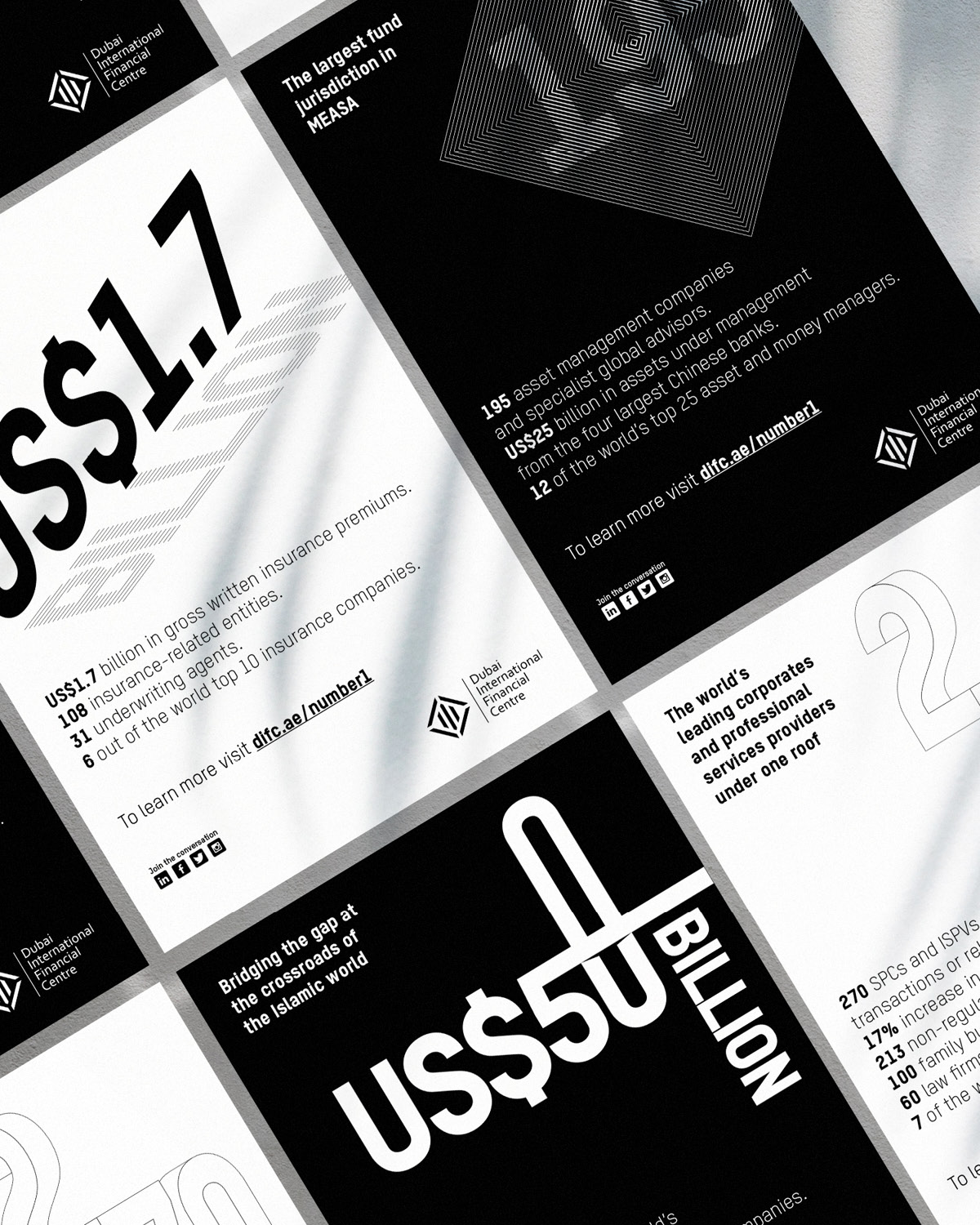
    DIFC has achieved strong growth and occupancy figures over their 15 year lifespan. Dragoman was asked to communicate these statistical achievements and give them market context, in an engaging and visual way.

    ——

    What we did

    The ‘No.1 campaign’ was DIFC’s first integrated marketing campaign. It aimed to raise brand awareness in key markets and generate new business leads. The campaign also spoke to existing DIFC tenants, confirming they were located within Dubai’s most prestigious financial community and amongst global industry leaders.

    Dragoman implemented a ‘seeded’ campaign approach, communicating one key achievement message each week, across a 12 week period. The bold typographic style presented key statistics in a bold and engaging way, celebrating their achievements through a playful numerical infographic.

    The campaign generated 23 million impressions, 85,000 clicks and 115 quality new business leads, with a never-seen-before conversion rate by the Business Development team.

    If you were interested in this case study, please click on the links below to see and read about:

    DIFC rebrand
    DIFC FinTech Hive branding
    DIFC Academy
    Harnessing Local Talent Campaign

    ——

    PROJECT DELIVERABLES

    Communications strategy
    Design
    Animation
    Campaign management

    ——
  • IQ data

    IQ data

    IQ data

    Evolving from a wifi company to designing data solutions that transform business strategies

    ——

    PROJECT OVERVIEW

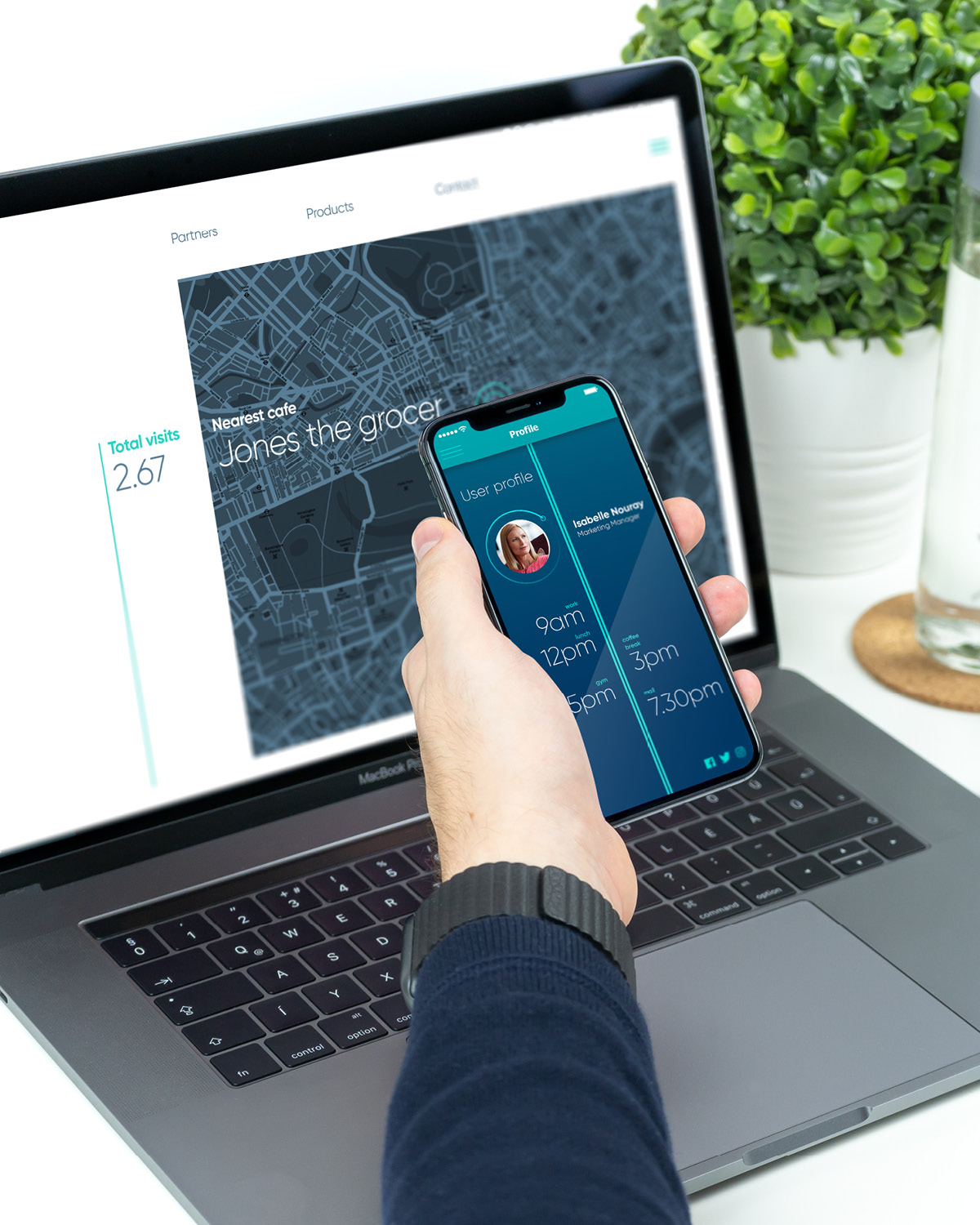
    IQ data had been in the market for a few years as IQ Wifi, a company that utilised Wi-Fi beacon technologies to help their clients better understand their customers needs and drivers. The company now had the technology and personnel to not only analyse the data from wifi solutions, but to provide its clients with a comprehensive suite of geolocation data solutions that merges the online and the offline worlds. They needed a brand that could help them take this new offer to market.

    ——

    WHAT WE DID

    We worked with the founders to not only understand the new offer and business strategy but to act as true partners, testing brand propositions and helping to focus the new narrative. Through a series of workshops we helped to identify the proposition area that retained enough of their existing market equity but created the brand proposition that would support business growth for years to come.

    We evolved the identity and developed a full visual language and design systems  for the brand to go to market. Key messaging created the right tone of voice and extended the new narrative across products and services. We then worked with their development team to map out the website journey and design the UX and UI.

    We continue to provide branding support and have created a strategic partnership with IQ data that allows us to provide data solutions for our clients and enrich our insights and customer understanding.

    ——

    PROJECT DELIVERABLES

    Brand strategy
    Naming
    Messaging
    Brand identity
    Design system
    Brand guidelines
    UX design

    ——

  • Majid Al Futtaim — Brand Audits

    Majid Al Futtaim — Brand Audits

    Majid Al Futtaim — Brand Audits

    Quantifying brand compliance across the organisation

    ——

    Project overview

    Post the launch of the brand there was continued investment in the brand to ensure its effective rollout across all business units. With an ever increasing drive for brand consistency across the organisation, it was time to see how effectively the new corporate brand was being implemented.

    ——

    What we did

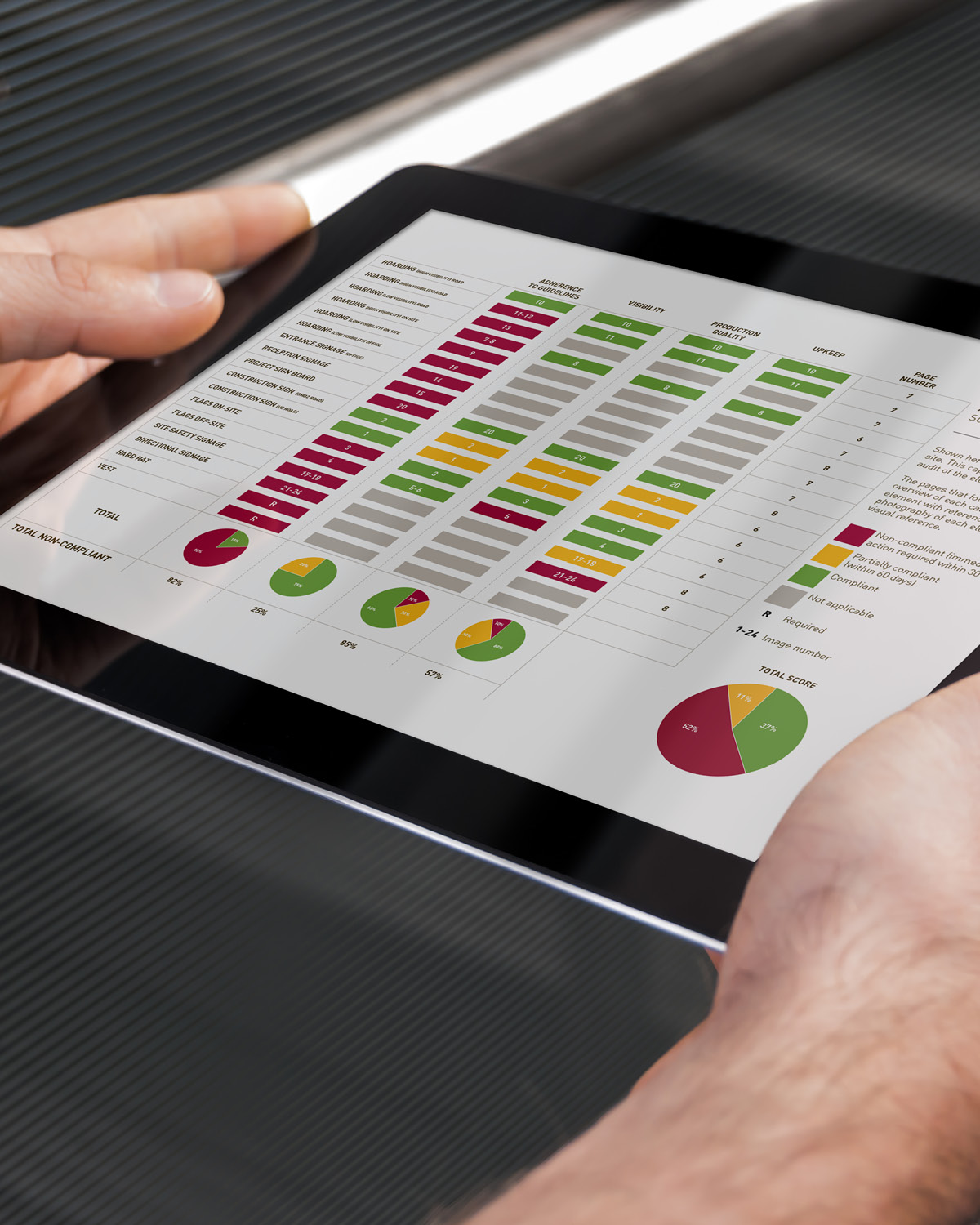
    The brand audit forms one part of the broader brand management services that Dragoman provide Majid Al Futtaim. The brand audit provide senior management with quantifiable year-on-year statistics of the organisation corporate brand compliance.

    Dragoman worked with the brand and marketing department to design a brand audit and reporting process. The brand audit process sets out the mechanism, the scoring criteria and the reporting format. The collation of branding samples is done by Dragoman and the internal audit team. A report is then generated for each site or department that provides the brand and marketing team with quantifiable. The final audit report defines brand compliance across the organisations, helping management to assess key criteria such as the success of strategic brand initiates, employee and department capabilities and brand guidelines relevance and usability. Any practical implementation issues with the brand roll-out were identified, along with anything affected by changes in the business strategy, and the results are updated in the evolving brand guidelines. The brand guidelines are accessible to all employees and partners through the brand portal.

    ——

    PROJECT DELIVERABLES

    Design systems
    Brand guidelines
    Brand engagement
    Brand portal
    Brand audit

    ——

  • Abdul Latif Jameel Land — J One

    Abdul Latif Jameel Land — J One

    Abdul Latif Jameel Land

    J One: Uncomplicated urban chic

    ——

    PROJECT OVERVIEW

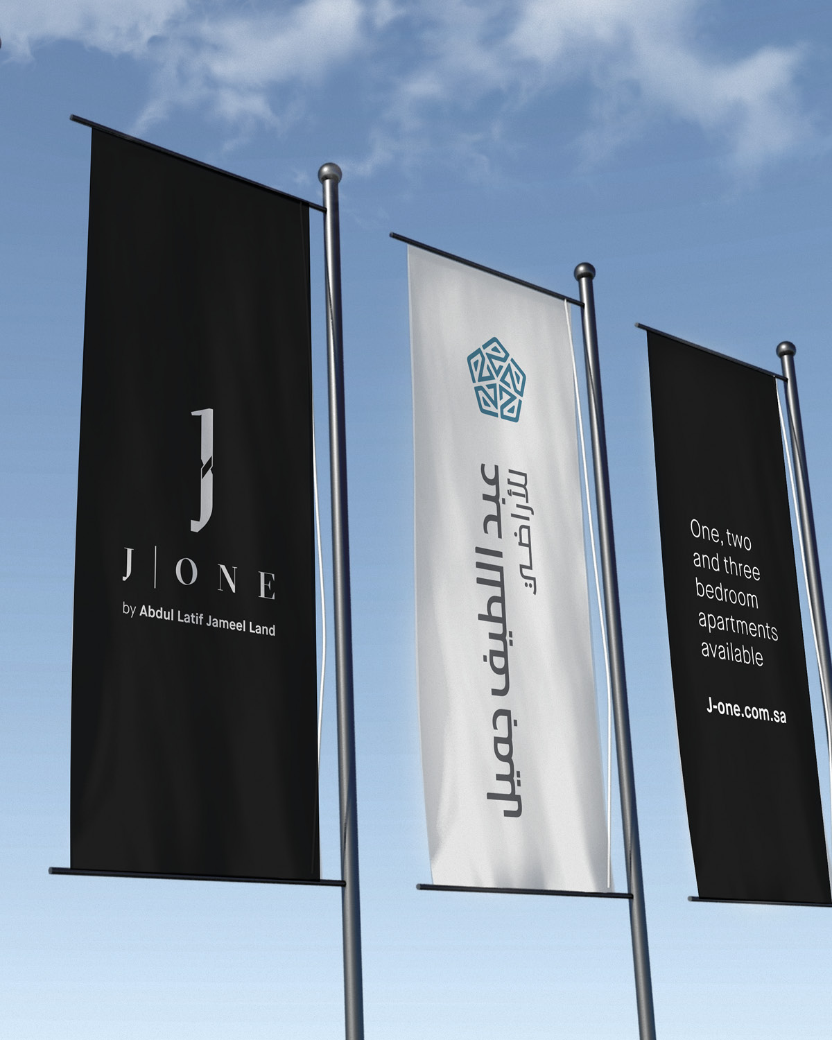
    Abdul Latif Jameel Land were in the process of planning their first residential development in Jeddah, Saudi Arabia. Abdul Latif Jameel Land approached Dragoman to develop the name, branding and endorsement system to the corporate brand.  

    ——

    What we did

    This was the first time that Abdul Latif Jameel Land had developed a project outside of their corporate portfolio and as such the link between the corporate brand and the project brand needed to be carefully considered. This was also not to be the last residential project and as such consideration needed to be given to this project being the first in a portfolio of developments. We reviewed the evolving business strategy and assessed the market to identify the brand opportunity. We developed a naming system that signalled this historic first step for the organisation, but also supported a future expanding portfolio.

    The development was looking to appeal to a range of audiences, from locals to Western expats and as such the brand needed to have a universal appeal whilst conveying the affluence and consideration to design and planning. The name J One was selected and a brand mark and visual language was developed that set the tone for the aspirations of the development and its future tenants. We also developed an endorsement system that clearly identified Abdul Latif Jameel Land as the developer through visual association and also through and endorsement line ‘The premier residential development by Abdul Latif Jameel Land’. A set of key messaging provided a communication platform to take the brand to market.

    ——

    PROJECT DELIVERABLES

    Insights and research
    Brand strategy
    Naming
    Brand architecture
    Brand assets
    Design systems
    Brand guidelines

    ——

  • Dubai Design District (d3)

    Dubai Design District (d3)

    Dubai Design District 

    Design transforms our world

    ——

    Project overview

    Dubai Design District (d3) is a community built in Dubai to house the top local and international design brands as well as foster local talent. d3 also plays a key role in supporting the vision of Dubai to the development of a knowledge based economy. A bold vision with many people invested in its creation and success. And being designers ourselves, we were as excited as anyone to help build this regional and global brand.

    ——

    What we did

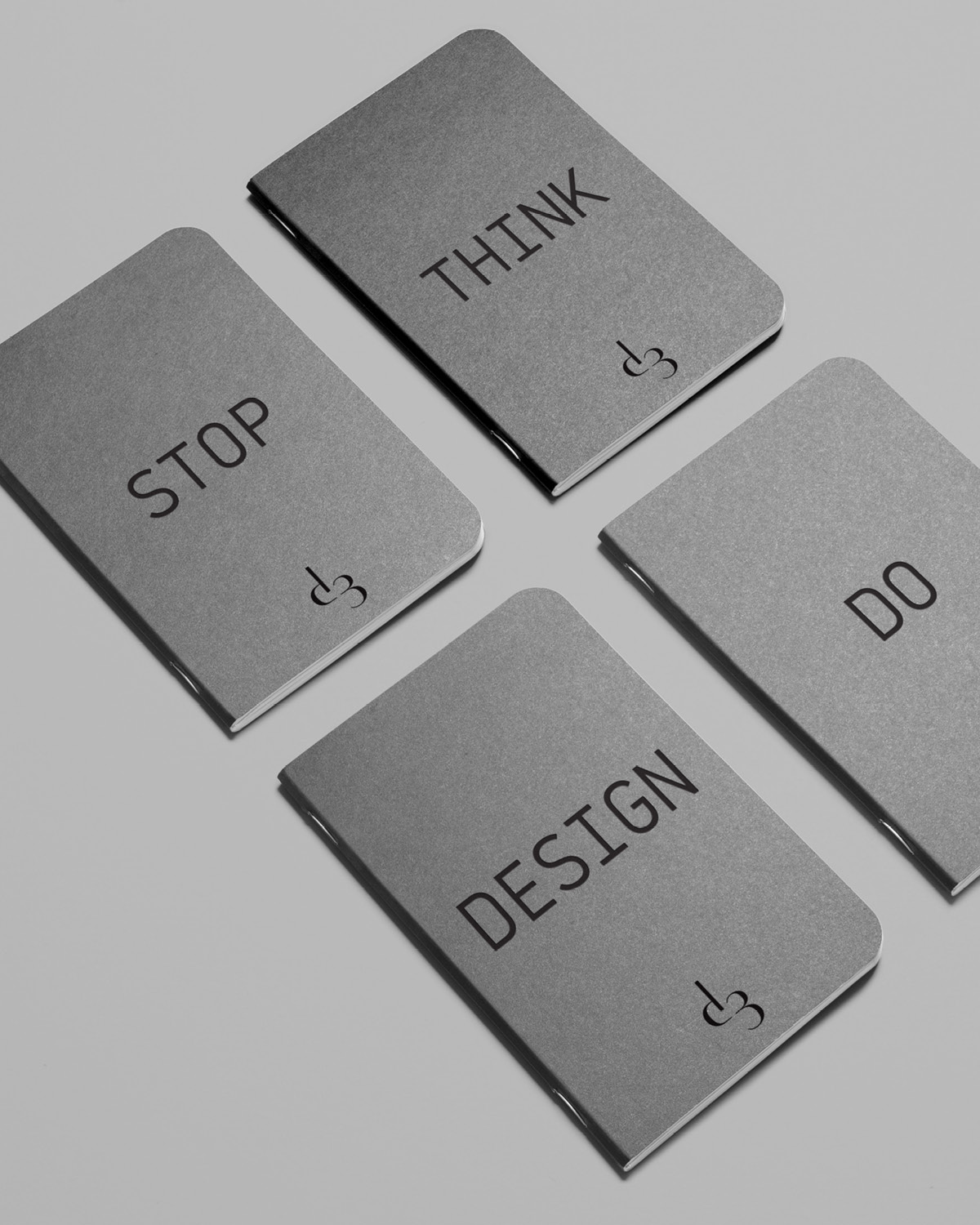
    Our first role was to engage with all stakeholders in interviews and workshops; management, local and global partners, tenants and the broader design and art community. It was evident that everyone was passionate about the project and its possibilities, even if their interpretations of the project were not always aligned. The trick would be to use the brand as a platform to focus this passion. We ring fenced the key themes that would help to build a single compelling narrative that was both true to the essence of design and that also captured d3’s unique proposition. This was documented in a brand manifesto and formed the basis for the brand strategy and the design systems and visual language development.

    True to the essence of design, the brand language was developed on a grid system which not only supported all design systems from print to digital to environment, but that also became the visual representation of the brand. Working with the idea that d3 is a platform for creative thinkers to prosper, the grid system manifested itself visually through simple (square or diamond) shapes. The use of only black and white for the brand created not only a powerfully simple and recognisable visual language, but in the spirt of d3, allowed the colours and diversity of the community to be the hero. The use of black and white also drew its influence from local dress and culture.

    ——

    PROJECT DELIVERABLES

    Insights and research
    Brand strategy
    Brand architecture
    Naming
    Brand assets
    Design systems
    Environment design
    Brand guidelines

    ——

  • Al Forsan Village

    Al Forsan Village

    Al Forsan Village

    Activating a vibrant community 

    ——

    PROJECT OVERVIEW

    The area surrounding the Al Forsan International Sports Resort (AFISR) was masterplanned to create a new and vibrant community in Abu Dhabi. This was also the first development of the newly formed Al Forsan Real Estate.

    ——

    What we did

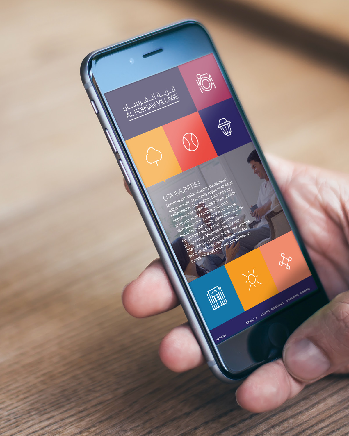
    To establish a new development brand in a crowded real estate market, we used the aspect of sport and its broader impact on a community as one of the key factors for the brand proposition. The impact that the development would have on the surrounding area and its community was also an inspiration, not only for the brand but also eventually the corporate development brand. The brand proposition, the fabric of the community, became the inspiration for a vivid brand. The various components of the development were brought to life through a tapestry of iconography and colour that conveyed a sense of excitement and created and engaging visual narrative that transcends nationalities and cultures to create a connected and vibrant community.

    ——

    PROJECT DELIVERABLES

    Insights and research
    Brand strategy
    Brand architecture
    Brand assets
    Design systems
    Brand guidelines

    ——

  • Dubai Economy

    Dubai Economy

    Dubai Economy

    Capturing the entity’s broader purpose

    ——

    PROJECT OVERVIEW

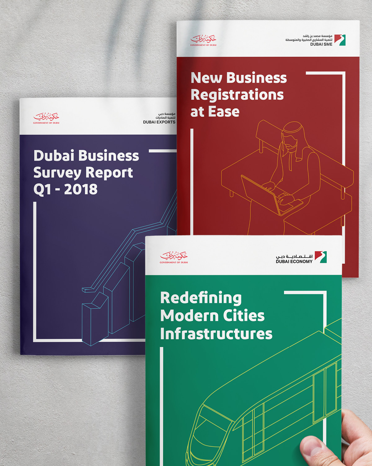
    The Dubai Economic Department was on the verge of their 25th anniversary. There was also a broader strategy by the Government of Dubai to further focus government entities and agencies around consumers and hence several DED services had been upgraded or replaced and most now existed in digital channels. The market facing brand was to be changed to Dubai Economy. The DED needed a new brand to reflect all the positive changes.

    ——

    WHAT WE DID

    The new name, Dubai Economy, was a fundamental shift in the agencies strategy to be more customer focused and shift to a private entity mind set. The name also signified the broader purpose of the DED and the role it plays in structural transformation across all aspects of the economy.

    We started by exploring the evolution of the brand to set the future state of the brand. We were conscience to retain the heritage of the last 25 years and equity that the DED had built to date. Each of the DED agencies, FDI, SME and Trade and Export had developed their own brand and whilst individually they are very successful, there was an opportunity with the name change and the 25th anniversary to align the agencies under one brand and represent the singular vision for a diversified economy.

    The DED and the agencies had also recently been very active in creating new services or updating old services and in their haste to get these new services to market had created a products and services portfolio that was difficult to manage and required significant resources and budget.

    Taking all of these key factors into account we proposed an evolved brand identity for the Dubai Economy brand and created a visual system for the agencies that clearly aligned FDI, SME and Trade and Logistics to Dubai Economy. We also reviewed the brand architecture and the products and services portfolio, creating a future map that defined the approach to each category and the link to the Dubai Economy or agency brand. Through this process we consolidated the portfolio considerably, removing nearly 20 brands and rather providing these services and initiatives with a branded or endorsed system that ensured that all activities were building equity in the Dubai Economy brand.    

    We worked with the client team to internalise and validate the new approach through a series of presentations and workshop with the senior management of the DED and the CEO’s of each of its agencies. Once the future brand direction was agreed we extended the new brand identity across multiple digital and real-world touch points, creating a comprehensive set of brand guidelines for Dubai Economy, FDI, SME and Trade and Export.

    ——

    PROJECT DELIVERABLES

    Insights
    Brand strategy
    Brand architecture
    Brand assets
    Design systems
    Environment design
    Brand guidelines

    ——

  • Al Jalila Children’s Specialty Hospital

    Al Jalila Children’s Specialty Hospital

    Al Jalila Children’s Specialty Hospital

    Where a child can be a child

    ——

    PROJECT OVERVIEW  

    Named after the youngest daughter of His Highness Sheikh Mohammed Bin Rashed Al Maktoum, Al Jalila Children’s Specialty Hospital is the first branded hospital in the region that specialises in advanced care for children.

    ——

    WHAT WE DID  

    Dubai Health Authority had a strong vision and clear brand proposition for the hospital from day one.

    The Al Jalila Children’s brand is a symbol of hope and care for families. The brand mission was to ensure that kids continue to smile and feel like they are at a safe place, even in difficult times.

    Dragoman was appointed to give ‘the region’s first childhood speciality hospital’ a joyful brand personality and bring the essence of the brand to life. Dragoman consulted with a diverse team of hospital staff, from all specialities, to ascertain how Al Jalila would be distinct and to ensure it was comparable to leading hospitals internationally.

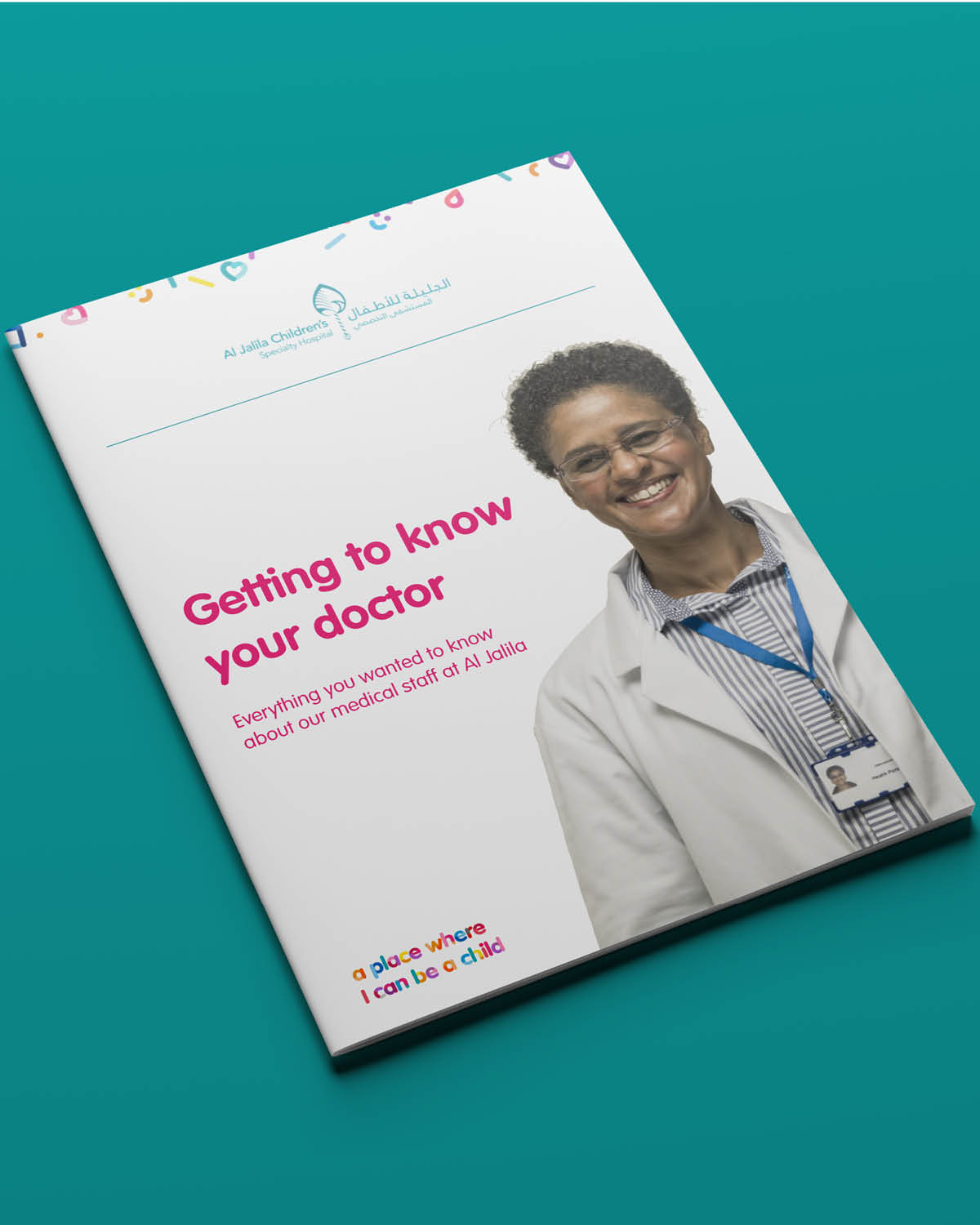
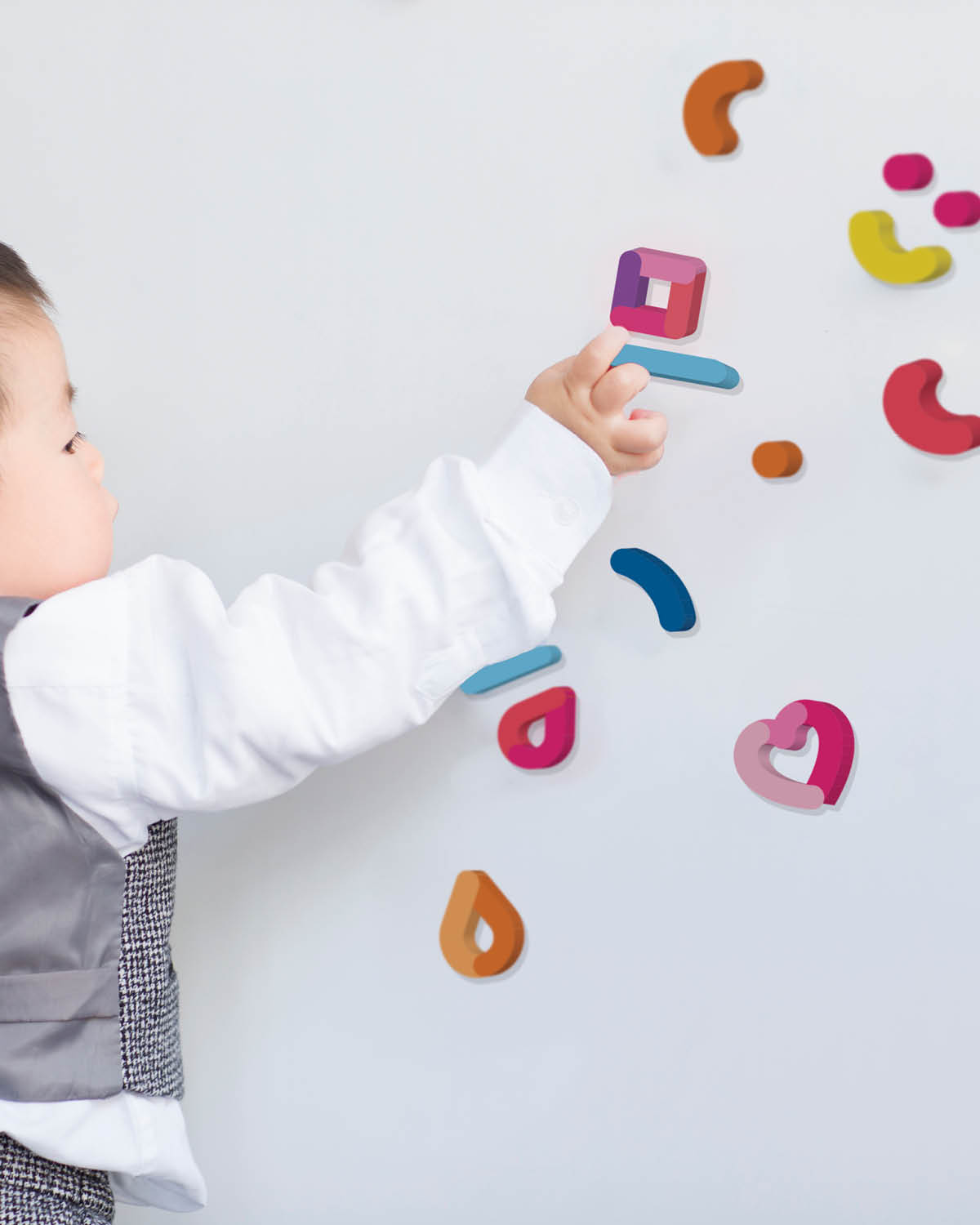
    The development of the hospital’s brand identity needed to visually be inspired by the Al Jalila Foundation, yet have its own unique feel tailored to its audience. The visual language and iconography were designed around the idea of ‘child’s play’, creating an approachable, warm environment and reflecting the caring attitude of the hospital’s caregivers.

    The brand needed to engage with children at every touchpoint. Something as simple as a doctor’s name badge was designed with two sides: one official and the other a cheerful first name introduction to the patient.

    Dragoman also worked on the directional signage and wayfinding which included environmental graphics to differentiate the hospital zones and create an approachable ambience. This created a coherent wayfinding system and a connected patient journey.

    The Al Jalila Children Specialty Hospital is not just a place where sick kids get treated by world-class medical practitioners, but it always remains a place where a child can remain a child.

    ——

    PROJECT DELIVERABLES

    Brand strategy
    Brand assets
    Brand identity
    Design systems
    Brand guidelines
    Environmental design

    ——

  • Al Jalila Children’s Specialty Hospital Signage and Wayfinding

    Al Jalila Children’s Specialty Hospital Signage and Wayfinding

    Al Jalila Children’s Specialty Hospital – Brand Environment

    Intuitive movement around a world-class facility

    ——

    PROJECT OVERVIEW  

    Named after the youngest daughter of His Highness Sheikh Mohammed Bin Rashed Al Maktoum, Al Jalila Children’s Specialty Hospital is the first branded hospital launched by Dubai Health Authority (DHA) that specialises in advanced care for children.

    ——

    WHAT WE DID  

    After Dragoman completed the brand creation, including the identity and all brand assets, we were asked to assist with the brand environment.

    A signage system had already been implemented by the architectural team during the hospital’s recent design and development stage. However, DHA felt that the wayfinding through the hospital corridors was confusing and counterintuitive. It wasn’t adding to the hospital experience, which should be a stress-free environment.

    Dragoman started by defining a wayfinding strategy that looked at the zoning and flow through the hospital. Dragoman’s environment team walked the entire hospital, assessing every perspective to ensure that patients were being provided with the correct information at all times. A colour system was applied to each zone to create visual differentiation. The signage design contained playful typography and iconography. The information design was carefully looked at to ensure legibility and contrast. The creative team designed environmental wall graphics that defined spaces, making key departments easily recognisable and assisted patients in moving through the hospital seamlessly.

    Dragoman was also heavily involved with the production, working closely with the signage supplier for during the implementation phase to ensure that all elements of the system were manufactured and installed to specification.

    ——

    PROJECT DELIVERABLES

    Typography
    Iconography
    Signage system
    Wayfinding
    Environmental design

    ——