Archives: Projects

  • Dubai Financial Markets

    Dubai Financial Markets

    Dubai Financial Markets

    From regional exchange to global entry to capital.


    “We worked with Dragoman team to reposition the DFM brand including our tone of voice and creating the full branding pack. The team are talented and great listeners, they took the feedback and produced high-quality work, and delivered what we had in mind for the brand. They are professionals that we will continue to work with.”

    Refresh the existing brand to position DFM as the leading entry point for capital markets in the MEASA region and elevate global recognition—shifting perception from a regional exchange to a gateway for accessing capital worldwide.

    We clarified the brand proposition and refined the brandmark, then built a visual language that is modern, sophisticated and flexible. The system was designed to communicate DFM’s role in enabling listed organisations to access capital, accelerate growth and scale.

    A minimalist, engaging design system that adapts across platforms while remaining precise and intelligent. The visual language reflects the diversity of sectors listed on DFM and scales from data-led communications to investor-facing narratives—consistent, recognisable, and easy to deploy.

    Brand positioning
    Brandmark refinement
    Visual language system
    Brand guidelines

    A sharper, more global DFM brand that reinforces leadership in MEASA and strengthens appeal to international issuers and investors.

  • Masarra

    Masarra

    Masarra

    From the wonder of Abu Dhabi
    to the world


    Dragoman embraced the time challenge and our developing business plan to deliver a brand our team is very excited to promote across the globe to grow tourism in Abu Dhabi.”

    Miral, the creators of the awe-inspiring experiences in Abu Dhabi, like Yas Waterworld, Ferrari World, WarnerBros. and Sea World sought to develop a destination management company (DMC) to elevate the tourism experience for travelers to Abu Dhabi and the UAE.

    The goal was to soft launch the brand at WTM in November 2024, which gave us 8 weeks to deliver the brand. We worked intimately with Asif Parker (General manager) and his newly formed team, to develop the brand. We formed a very close working relationship exploring and testing new ideas as the business plan was unfolding.  We also set up a global community of travelers to provide real-time feedback on the brand as we developed it.

    DMCs often focus their brand on the role they play with travel operators and position themselves on their functional attributes. We recommended we define our brand purpose on the role we play in helping travelers fulfill their travel experiences.

    Purpose:

    Delight people in the wonder of our world 

    Promise:

    Savour the world 


    We then created an ownable name in Masarra that originates from the word for delight and happiness in Arabic but with a unique spelling for ownership. 
    Our identity combines the local flavor of Abu Dhabi with the opening of the window to the world. We combined with our GenPlus group partners and their PR agency to soft launch the brand at WTM and develop the comms for the brand as it goes to market to sign up its partners.

    • Brand Positioning
    • Name, Identity, Visual system
    • Guidelines
    • Video
    • Communication

    Masarra is successfully signing up global travel operators and local travel providers to curate and deliver authentic and extraordinary experiences for their Abu Dhabi visitors.  

  • Gate Avenue

    Gate Avenue

    Gate Avenue

    Sounds. Surrealism. Selfies. Sushi.

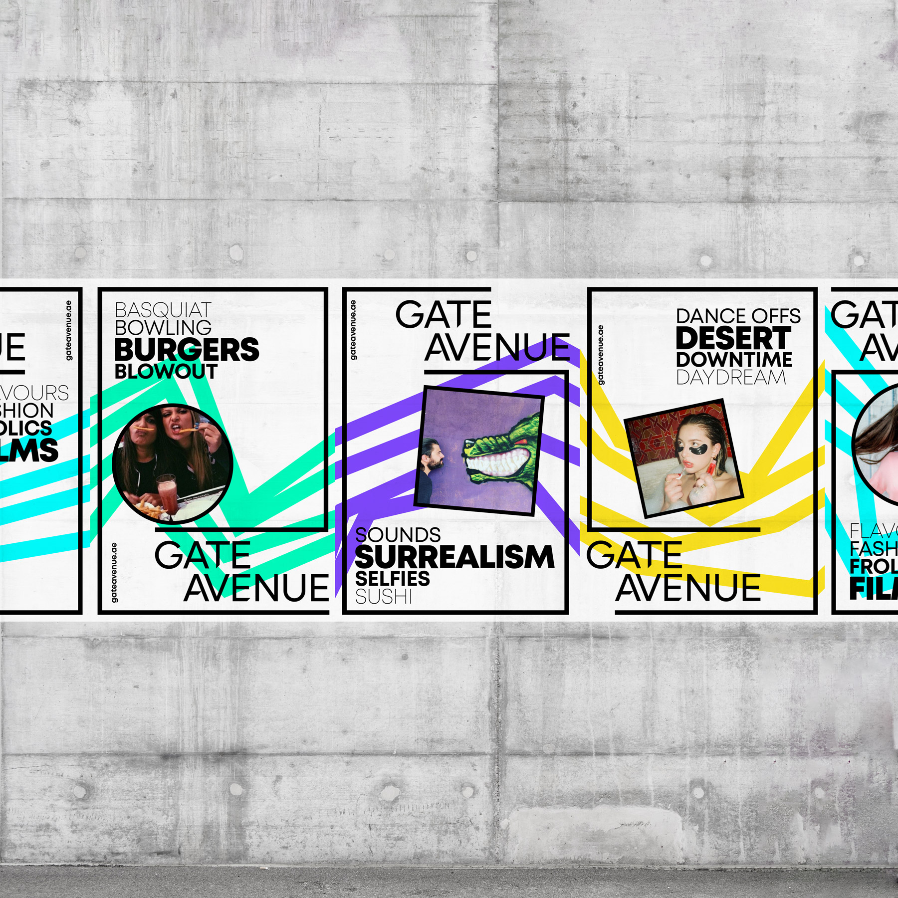
    Create a brand that fits the DIFC portfolio, strengthens the destination brand and most importantly, gets people to visit Gate Avenue. Additionally reposition from a premium mall to an accessible, community-led urban destination with multiple experiences. Goal: increase footfall.

    We reviewed the market and built on the DIFC destination positioning to carve out a distinct retail role. We defined a brand positioning, personality and tone that stay energetic and adaptable to the fast-changing nature of retail. We designed connected systems linking online and offline for a seamless end-to-end experience.

    We articulated Gate Avenue as the urban spine that runs the length of DIFC. The visual system uses four gates as entry portals, paths that guide people to eclectic experiences across retail, food, fashion, art and entertainment. The identity is bold, dynamic and more accessible, introducing youthful energy while maintaining DIFC credibility. Messaging focuses on everyday discovery and community engagement.

    Insights & research
    Brand positioning & proposition
    Brand identity (brandmark & visual language)
    Design system & brand guidelines
    Launch campaign & video

    A clear, distinctive destination brand that sits comfortably within the DIFC portfolio and invites broader audiences to visit, driving a 50% increase in footfall and elevating DIFC’s overall destination appeal.

  • Quardlock

    Quardlock

    Quardlock

    Impenetrable.

    Quardlock had designed and developed the world’s most advanced offline biometric security technology and needed a brand to support their next stage of business growth and market expansion. With the digital world creating massive opportunities for business and society, it also creates risks and dangers with individuals, companies and countries as they are exposed to malicious activity such as identify theft, financial losses and industrial espionage. But if you use Quardlock’s biometric off-line security for identity verification, physical spaces, digital access and transaction authentication, you become impenetrable. 

    We worked with the Quardlock senior management and technology teams to develop the brand positioning and brand identity.

    This laid the foundation for the brand positioning. The brand tone of voice had to demonstrate solidity and be direct in the way it communicated. No fluff, to the point. We kept the brand assets simple with a view to create immediate impact and also to be adaptable to the various sectors that the technology is relevant for. We worked with the business development and management team to create messaging and a tone of voice that would aid in telling the broader story, quickly framing the threat, but very quickly move to how Quardlock provides the solution. 

    Brand positioning
    Brand strategy
    Design systems
    Brand identity
    Brand guidelines

    Sales orders grew. Investors wanted to be buy into the brand and the parterns existed after 2 years.

  • Eve List

    Eve List

    Eve List

    Equivalency.

    ——

    PROJECT OVERVIEW  

    We worked with the NGO Eve List to create a new brand to engage a broader audience and give some energy to their purpose.

    ——

    WHAT WE DID  

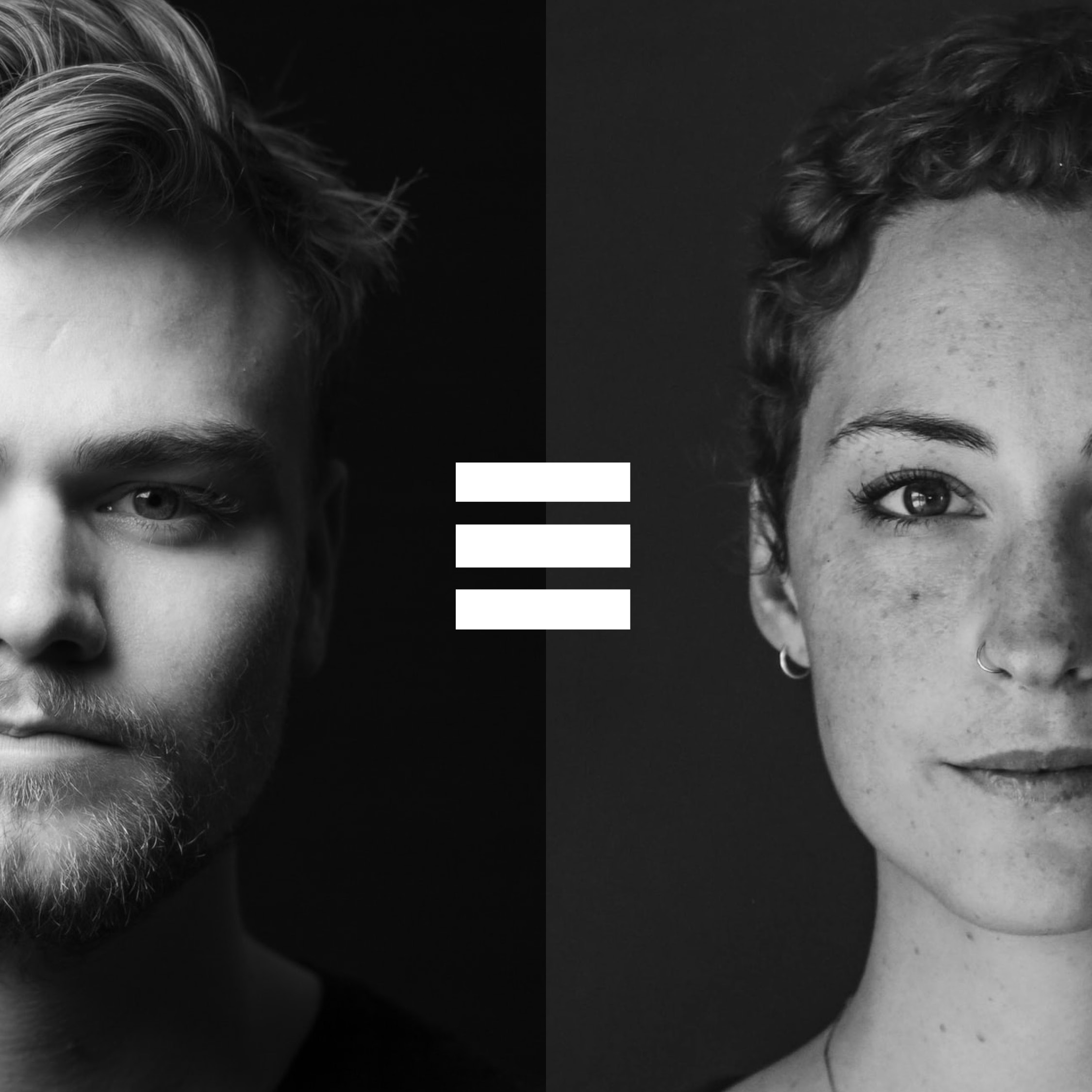
    We worked with the founder to really get under the skin of the issue and create a brand that could not only engage multiple audiences, but also create a platform for conversation, ultimately towards creating understanding and equivalency in our workplace environment. We are better when we are working together to solve these societal challenges and as such the brand was centred around the idea of coming together and enhancing each other. This was done through graphic symbols of +, x and ≡, an engaging and open tone of voice and a range of colours for energy.


    ——

    PROJECT DELIVERABLES

    Brand positioning
    Brand strategy
    Design systems
    Brand identity

  • Carrefour

    Carrefour

    Carrefour

    From “low prices” to “more for you”

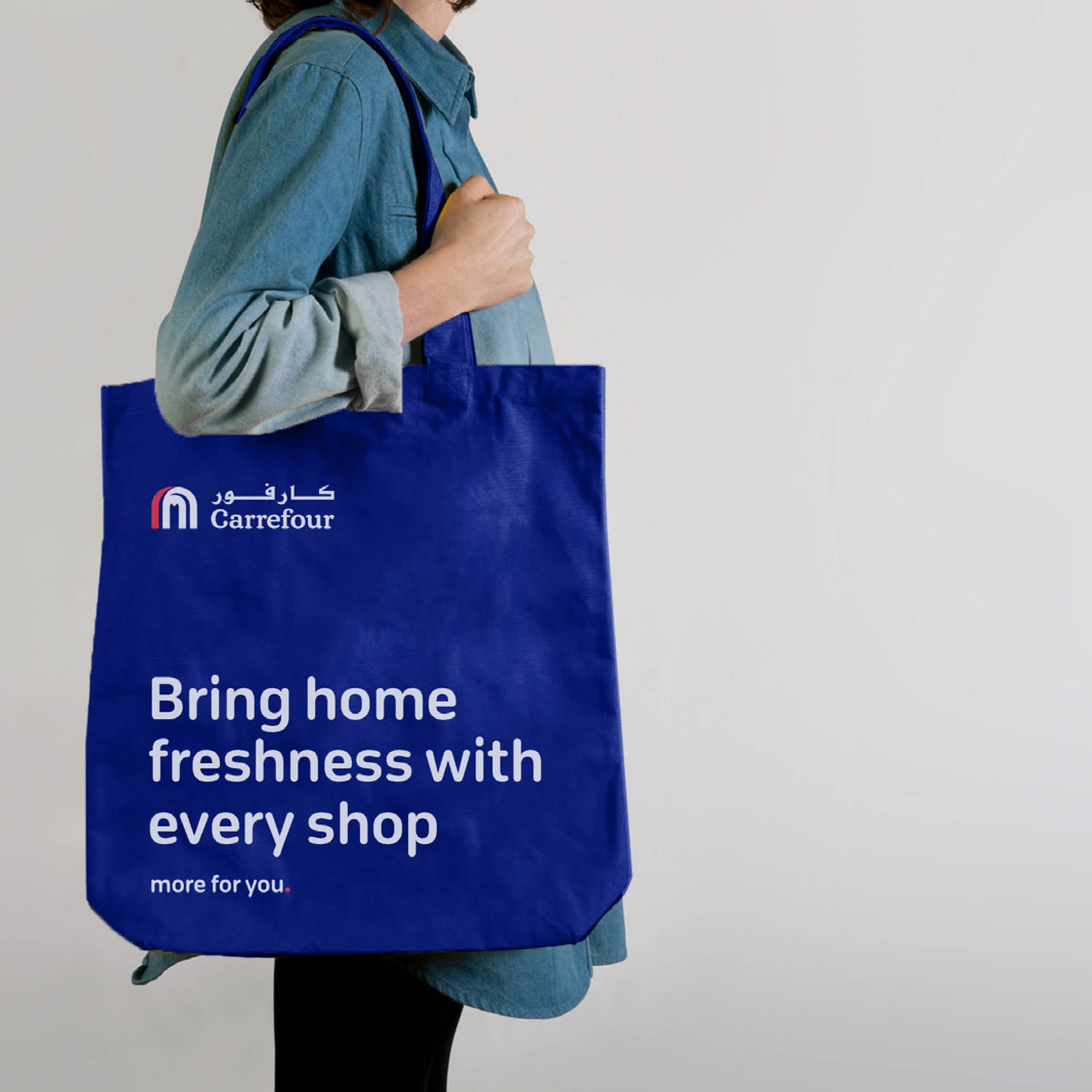
    Consumer behaviour was shifting across the Middle East and globally. Carrefour needed to reassess the relevance of its proposition against these changes—moving beyond a price-only stance to a broader, customer-value promise that could sustain leadership and growth.

    We partnered with a research firm to map core behavioural shifts and motivations, identifying key shopper segments and their future trajectory. Using these insights, we developed brand propositions, tested them with Carrefour leadership and in market, refining based on evidence. With a direction set, we created design systems for store, communication and livery, piloted them in select locations, gathered feedback, and iterated. Final rollout was supported by comprehensive brand guidelines that captured the narrative for change and specified the system for consistent execution.

    A refreshed value proposition anchored in everyday value, not just price. We simplified the in-store experience so offers are easier to find and benefits are explicit, and introduced a direct, customer-first messaging framework applied across channels, stores and fleet, unifying visual language, signage and livery into one coherent system.

    Market research & consumer insights
    Brand proposition development
    Messaging framework & visual language
    In-store & signage system
    Brand livery & rollout guidelines

    Carrefour shifted from a price-driven offer to a “more for you” promise, boosting customer engagement and reinforcing long-term market leadership.

  • Nomas

    Nomas

    Nomas

    Let life flow.

    ——

    PROJECT OVERVIEW  

    Create a brand for a residential development that was focussed on the lifestyle and not the buildings.

    ——

    WHAT WE DID  

    Generosity can be highly contagious. When we act kindly toward one person,
    that person is much more likely to be kinder toward others in the future.

    This starts a ripple effect of kindness. It starts as a single act, but then spreads outward affecting many more.
    Our acts of kindness don’t only affect the people we do nice things for,
    but many other people who we may never even come into contact with.

    Nomas creates the ripple effect in our society, where shared values,
    views and moments will lead to the fulfilment of the simplest of life’s pleasures. It is here that every conversation and interaction comes to life. .

    The name ‘nomas’ means contentment and amplitude. 

    ——

    PROJECT DELIVERABLES

    Brand positioning
    Brand strategy
    Design systems
    Brand identity
    Brand guidelines

  • RedSea

    RedSea

    RedSea

    From product to purpose.

    Red Sea Farms needed a brand platform that would support their current success and market growth, but also allow them to transition to a brand that better reflected the cutting edge technology that they research, design and implement. Ultimately the new brand must support a rapid growth strategy so that they can achieve their admirable purpose to ‘Feed the World Sustainably’.   

    HOW WE WORKED  

    We worked with the company founders and leadership team to capture the essence of the company and ensure that whilst creating a brand that had a technology focus, that the core humanity of the brand would be retained.

    THE SOLUTION

    We captured the purpose of the brand and the existing culture in a new brand narrative and created a brand architecture that helped to structure the business to continue their current success and to leverage brand success for future sustainable growth opportunities. 
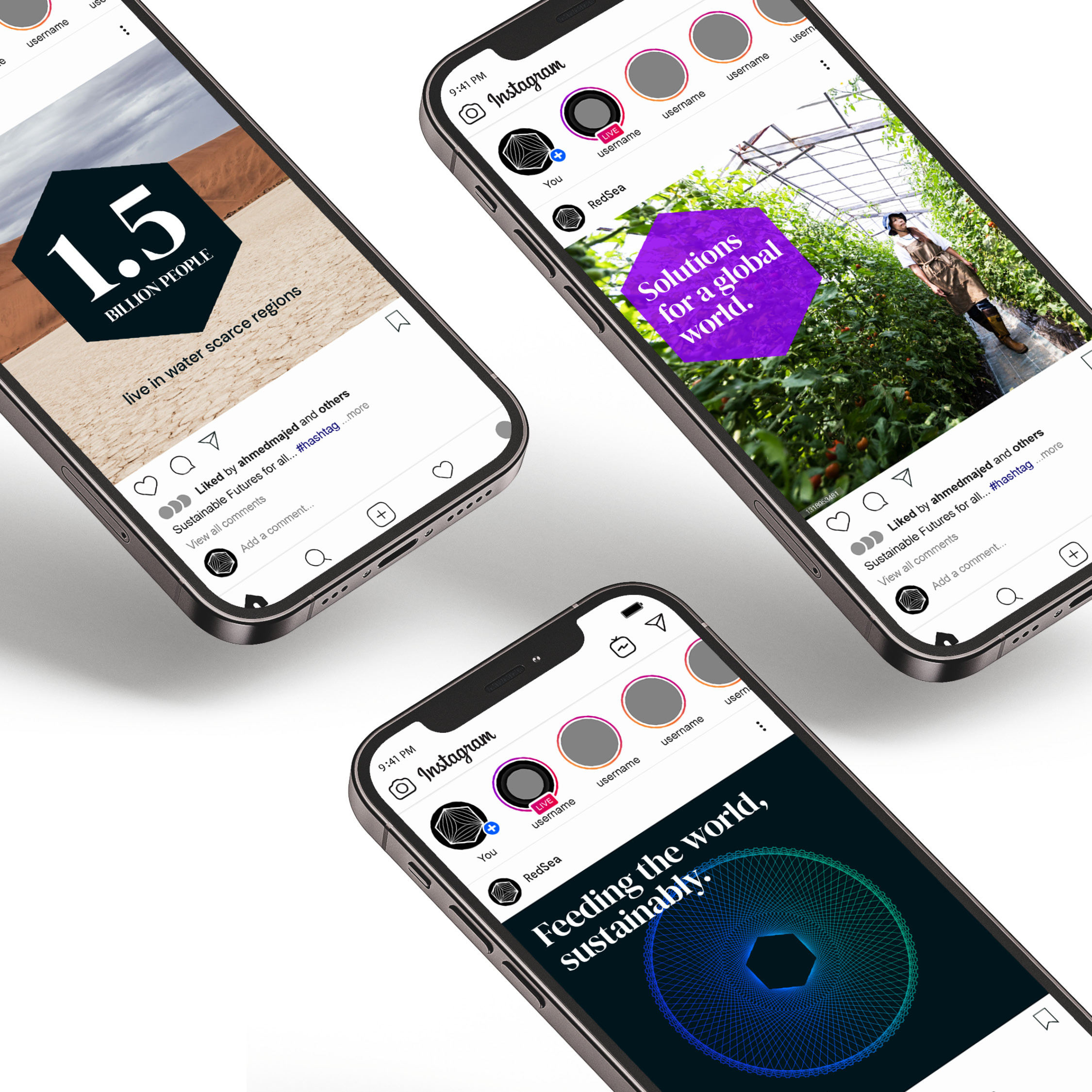
    The brand strategy and brand architecture was supported by a new brand identity and brand language for rollout across digital channels, investor communications and environments.

    Brand positioning
    Brand strategy
    Brand architecture
    Brand story
    Brand identity
    Brand guidelines

    THE RESULT

    The successful repositioning to a technology company opened up opportunities to focus the business and shortly after the rebrand receive US$ 15m in funding.

  • Sharrai

    Sharrai

    Sharrai

    Designing an intuitive online experience

    ——

    PROJECT OVERVIEW  

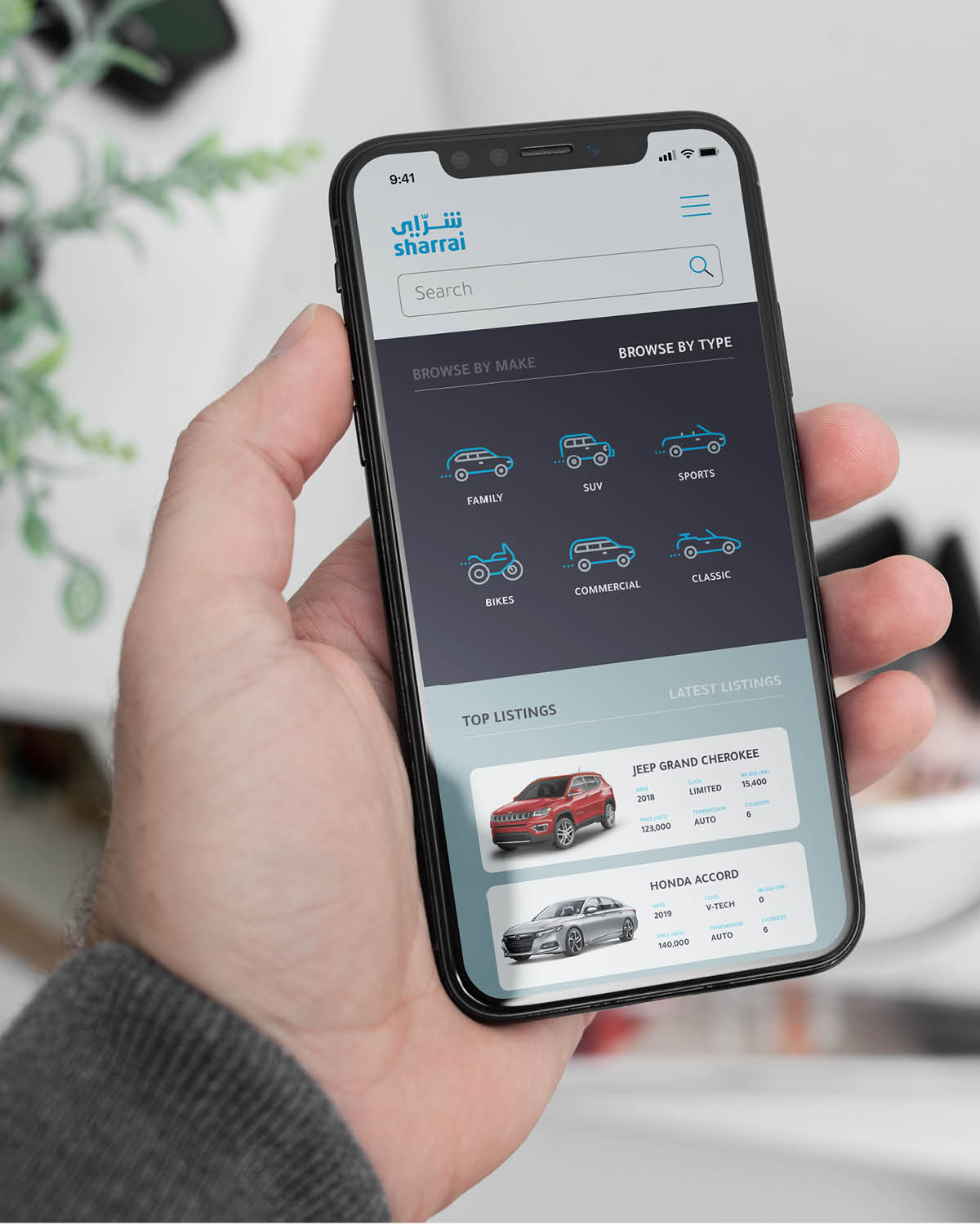
    Sharrai was established to support the growing Sharjah automotive industry. Its goal is to transform the local used car industry and create a competitive environment for both buyers and sellers. The Sharrai online platform offers a digital used car showroom and to deliver a complete auto experience.

    ——

    WHAT WE DID  

    Dragoman was initially asked to create a revised brand identity and visual language for their digital platform and its communications.

    However, after workshops with key stakeholders, the creative team was asked to redesign the user interface and components of the user experience across their website and app. Their current customer journey didn’t fulfil the business’s vision or address customer needs.

    Dragoman’s recommended UX was intuitive and user-friendly, offering a seamless browsing and shopping experience. Tailored customer journeys were designed for both desktop and the app, to better suit user habits on each device.

    The final brand assets were rolled out across communication campaigns, outdoor advertising and all digital assets.

    ——

    PROJECT DELIVERABLES

    Market insights
    Brand identity
    Brand assets
    UX
    Digital assets
    Website

    ——