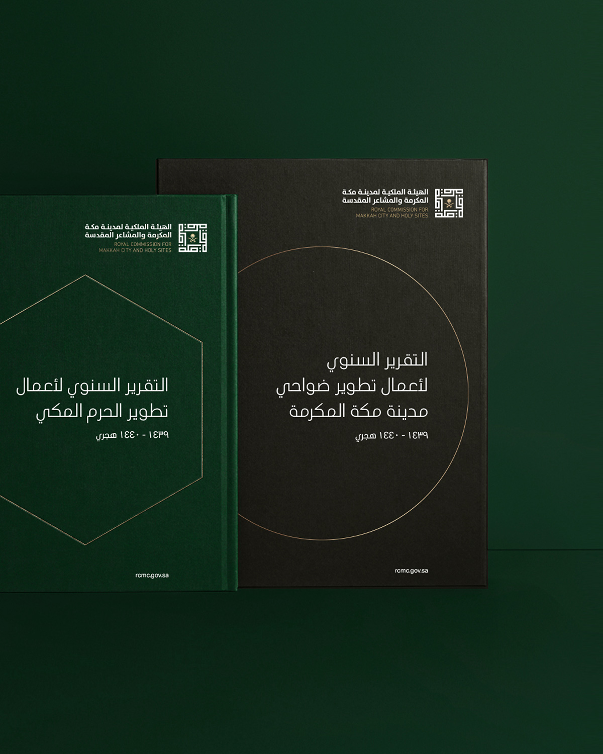
Royal Commission for Makkah City and Holy Sites
A renewed experience
THE CHALLENGE
In 2018, the Royal Commission for Makkah City and Holy Sites (RCMC) was established by the Kingdom of Saudi Arabia. Dragoman was appointed to create the identity, design systems and all brand assets. This was then approved at the highest level by HRH Salman bin Abdulaziz Al–Saud, Custodian of the Two Holy Mosques.
As a new brand and organisation, it was imperative for extensive brand guidelines to be created to ensure the consistent rollout of the brand, both internally and across external communications.
THE SOLUTION
The guidelines introduced the brand strategy and showcased how to use the RCMC brand assets correctly and confidently. It also influenced how they speak as an organisation and will be used long term to assist in the development of their company culture.
The document includes all guidelines around the new brand identity, to ensure it is used with the utmost respect and always reproduced using the official artwork files.
The identity guidelines were supported by a unified set of brand assets and a colour palette that are distinctively RCMC. These allow the brand to visually express itself while staying coherent and considered.
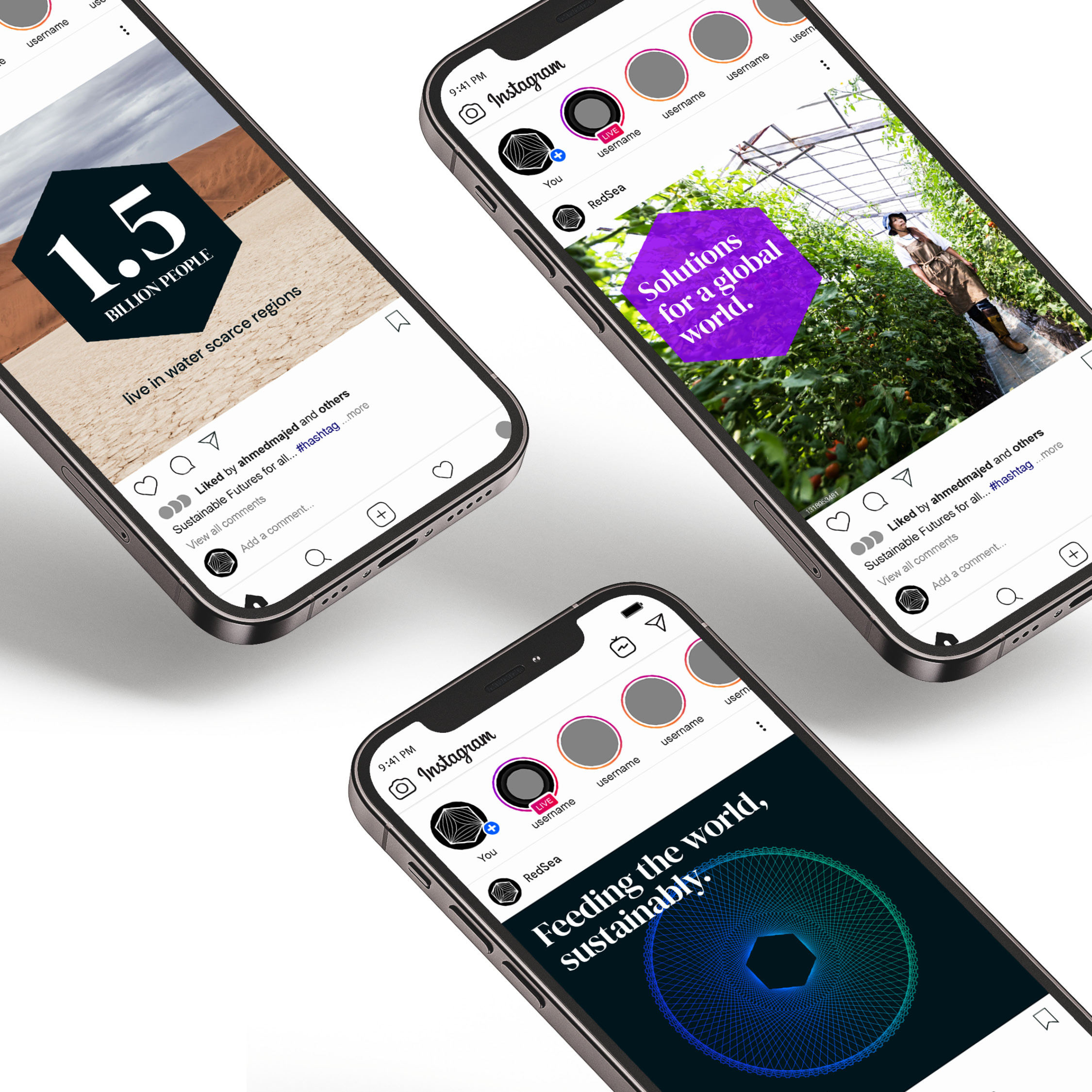
Additionally, photography was used as the primary method of visual brand storytelling. The guidelines included a library of images that can be utilised across all types of communication.
These visual components were paired with the introduction of a dual language font, to reflects the brand’s ambition for clarity, legibility and accessibility.
The guidelines detailed the application of the brand across a broad range of internal elements and communication collateral, including stationery, employee welcome pack, staff apparel, livery, publications, website, digital advertising, social media and corporate office interiors.
Finally, the production specifications and paper stocks were rigorously selected. Highgrade proof testing, across digital and offset, was completed to ensure a premium reproduction of the colours and metallic finishes.
The first round of these guidelines are now complete and being introduced internally through a brand ambassador program. Further iterations will continue as we work with this long term client.
PROJECT DELIVERABLES
Insights and research
Brand strategy
Brand identity
Design systems
Brand guidelines
Brand management