Archives: Projects

  • DIFC Developments

    DIFC Developments

    DIFC Developments

    From global financial services innovator to shaping the future of urban living.

    DIFC plays an integral role in supporting the future economy. DIFC believes that the design and experience of the urban environment where people work and live, is critical to fostering innovation, wellbeing, and sustainability. To date, DIFC has built and managed the existing real estate for the DIFC destination.

    However, with the DIFC 2.0 destination set to break ground, DIFC needed to capture and articulate its distinctive approach to development and create a brand platform for its future masterplanning activities.

    We partnered with DIFC to articulate a masterplanning brand that aligns with their ambition to lead in urban development. Through collaborative workshops and iterative development, we refined the story, positioning, and identity, always mindful of the equity in the existing DIFC brand, while creating a new brand fit for purpose in the context of masterplanning.

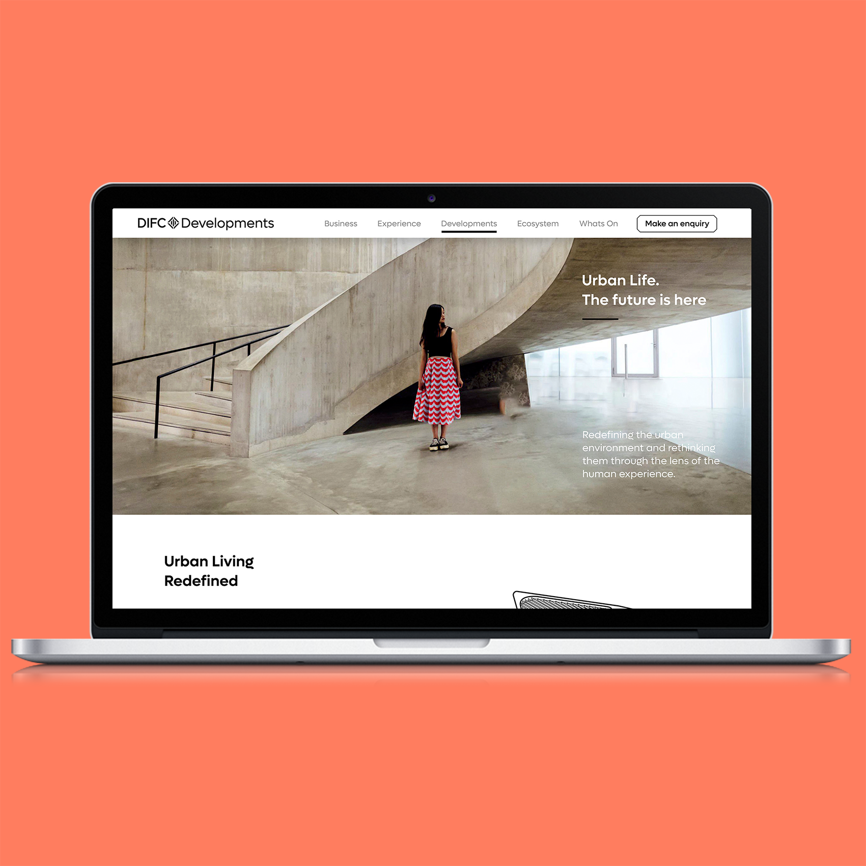
    The new identity leverages the strength of the DIFC brand, while defining a clear strategy and differentiated expression for DIFC Developments. The brand combines architectural precision with vibrant visual storytelling to create an identity that flexes seamlessly across platforms, from digital to experiential, reinforcing DIFC’s role as an urban master plan developer.

    We also created a framework and endorsement system for the communications and marketing of products—from entire districts to specific experiences and individual towers, ensuring each expression builds the DIFC Developments brand.

    Brand Positioning
    Brand Identity
    Brand Architecture
    Naming
    Messaging Framework
    Brand Guidelines

    DIFC Developments relaunched as a master planner and developer of a vibrant urban destination that promotes innovation, harmonious living, and sustainability.

    Urban life.

    The future is here.
  • xCube Access

    xCube Access

    xCube Access

    From market access to growth advisory

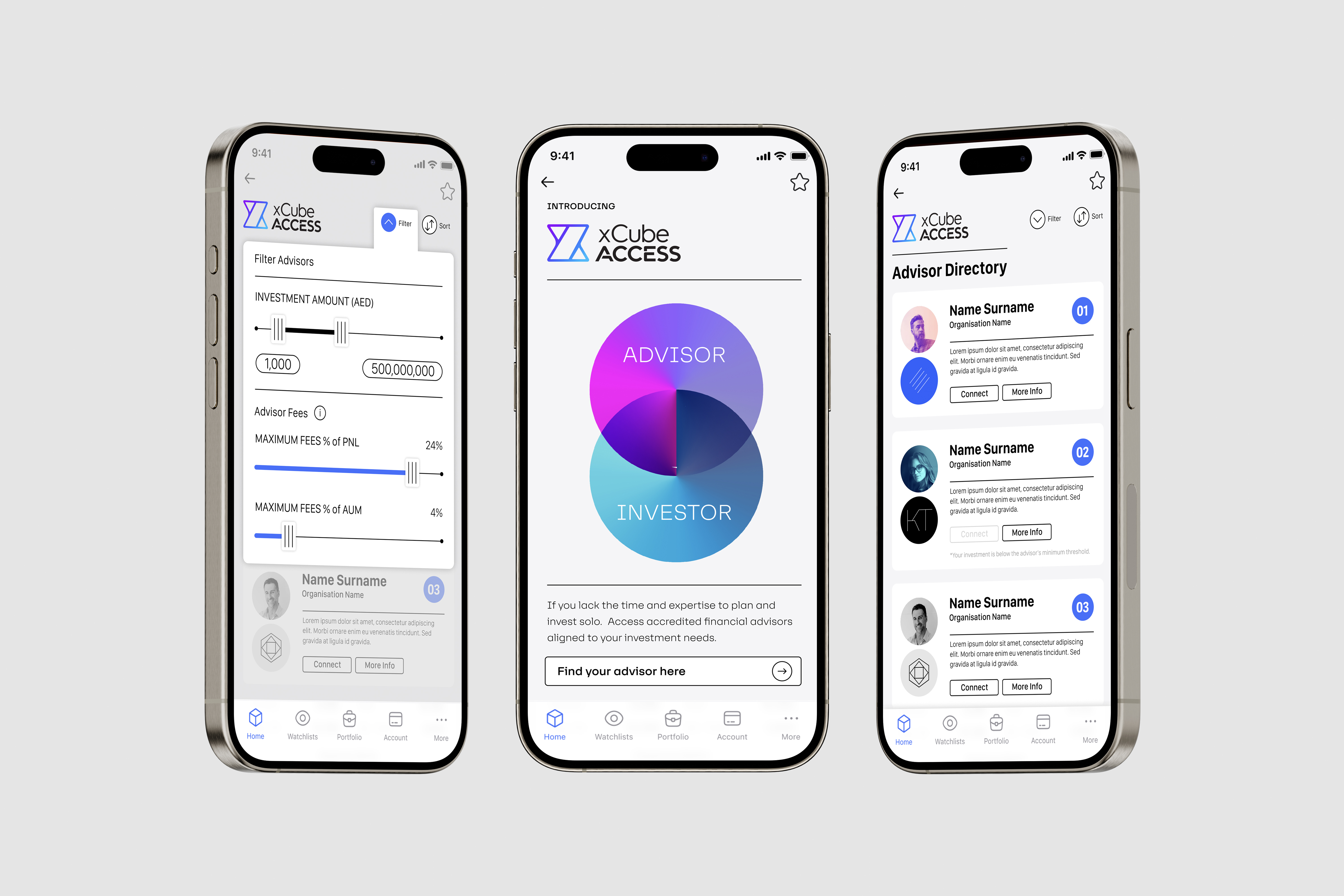
    As part of xCubes vision to improve the overall competitiveness of capital markets in Dubai, the company created a new advisory platform for the market. The platform connected advisors and investors, providing both with optimal opportunities for growth. The new brand need to represent the growing ecosystem at xCube whilst being relevant to the new offers target audience.

    We worked with the leadership team of xCube to develop brand propositions that explored the extension of the xCube brand whilst building a credible and relevant offer for the advisory platforms target audience. The propositions explored the use and extension of the xCube name, brand identity and specific personality, positioning and messaging for the new brand. 

    We landed at the optimal solution, developing a name, unique brand identity and messaging house that laid an agile platform for the launch of xCube Access to the advisory community and then later to the investor community. 

    Brand Positioning
    Brand name 
    Brand Identity
    Visual System
    Company prospectus

  • Ignyte

    Ignyte

    Ignyte

    From startup platform to global growth partner.

    Ignyte needed a brand that matched its ambition: to be more than a platform, to be a global growth partner for startups. The challenge was to create a brand that captured the spark of bold ideas while inspiring trust, scale, and impact.

    We partnered with Ignyte’s leadership to align the brand with their vision for the future of business. Through workshops and iterative collaboration, we refined the story, positioning, and identity to communicate clarity, creativity, and confidence. Together, we crafted a narrative and visual identity to connect with founders locally, regionally and globally.

    We created a clear story and confident brand identity that captures the spark of bold ideas and the ambition and vision of founders and startups. The brand is dynamic, combing technology greys with inspiring brighter yellows that demonstrate the dynamic nature of business and the aspiration of entrepreneurs. As with the business of the future, the brand is agile and versatile, easily adapting to different content requirements.

    Brand Positioning
    Brand Identity
    Brand Sonic
    Messaging Framework
    Brand Guidelines

    Ignyte relaunched with a brand that speaks to ambition and possibility:

    The future of business is;
    Empowering.

    Innovative.

    Transformational.

    Exponential.

    The future is here.

  • Leap

    Leap

    Leap

    From financial services to startup community

    The brand had to achieve two key objectives; appeal to the startup and founders community and support DIFC’s innovation journey.

    We used Leap’s “Hyper Driven” philosophy as the anchor, then designed the brandmark, typography, colour, graphic language, tone of voice, messaging and values so every element pointed to smarter, faster, safer business growth. We kept language crisp and operational, avoiding fluff. 

    We defined Leap as “the growth platform to accelerate and scale your business smarter, faster, and safer,” with a brandmark that captures forward motion, a flexible graphic system that uses colour and movement to signal momentum, and a tone of voice that is clear, intelligent, inspiring and confident. The message house emphasises the DIFC ecosystem of capital, talent and community and the values operationalise the brand through agility, delivery, energy and inquisitiveness. 

    The future of business is;
    Hyper driven,
    Hyper innovative and
    Hyper connected
    The future is here.

    Brand positioning and narrative 

    Brandmark, typography, colour and graphic language system 

    Tone of voice guidelines and message house 

    Values and behaviours 

    Brand applications toolkit and Brand guidelines 

    Leap now has a cohesive, future-facing brand that is simple to use and consistent in market: a dynamic identity that signals acceleration, a concise voice that talks like the audience, and messages that make the DIFC community’s advantages clear. 

  • Arena

    Arena

    Arena

    Arena Private Market: Making capital work for you.

    Introduce a new private market from DFM in a way that clearly explains the offer to founders and accredited investors: eligible private companies gain access to growth capital while retaining control; investors can participate in growth companies earlier on the path to a potential IPO. The brand also needed to preserve DFM’s credibility and attract both sides of the market.

    We created a simple brand language referencing positive market signals and built practical tools for consistent use. We launched at Dubai Capital Market Summit and supported the team with the keynote, launch video, website, and brand governance.

    We positioned Arena as DFM’s private market platform connecting eligible private companies with accredited investors. We defined a direct value proposition and produced guidelines and launch assets so the brand could be deployed consistently across presentations, video, and web.

    Brand strategy

    Brand positioning

    Brand identity & design system

    Brand architecture

    Launch video

    A clear, credible market introduction that explains the offer, signals DFM trust, and enables efficient rollout across summit, video, and web.

  • DIFC

    DIFC

    DIFC

    From financial services to economic innovator


    “Dragoman was instrumental in driving the first full re brand of DIFC since its inception in 2004. As an extension of our team, we were able to re position the centre from a traditional financial service brand to an innovation brand with the full buy in from stakeholders. Successful awareness campaign to support the repositioning of mother brand as well as sub brands was developed by Dragoman from overall creative conception, video, copy, online and print. Projects are always approached with enthusiasm, care and a focus to deliver on-time with quality. Having regional experience with similar government and semi government entities, the Dragoman team were able to understand our requirements and help us push boundaries in a respectful and considerate way”

    DIFC needed to reposition itself from a financial hub to a holistic business and lifestyle destination while maintaining relevance for large financial corporations and emerging technology firms.

    Dragoman developed a dynamic brand strategy, balancing DIFC’s corporate heritage with a forward-thinking identity that appealed to financial and technology sectors alike.

    A refreshed brand proposition, visual language, and launch campaign were developed to establish DIFC as a center of innovation and business growth.

    Brand positioning
    Brand strategy
    Brand architecture
    Brand communication 
    Brand guidelines
    Brand management

    The rebranding positioned DIFC as a future-ready financial and business hub, attracting both corporate and startup communities.

  • The Prime Minister’s Office (PMO)

    The Prime Minister’s Office (PMO)

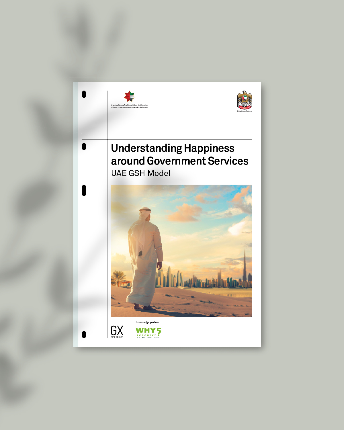
    The Prime Minister’s Office – Happiness Report

    Communicating the UAE Government’s success

    ——

    PROJECT OVERVIEW  

    Attaining happiness is a global pursuit. The United Arab Emirates (UAE) Government has always had deep regard for its citizens’ wellbeing and believed that there is a correlation between their happiness and the growth of the nation. As a result, it sought a deeper understanding of happiness amongst its citizens and residents.

    The Prime Minister’s Office (PMO) conducted a state-of-the-art research study with leading partners to develop the UAE Government Services Happiness Model. This ground-breaking research was transformed into actionable recommendations at a government service level, with a view to better meet the needs of UAE citizens and enhance their overall happiness.

    This global first needed to be shared with academics and leaders across the world. Dragoman was appointed to write and design an in-depth report, documenting the project’s success.

    ——

    WHAT WE DID  

    Dragoman worked with the PMO’s research team and senior management to tell the story of the research methodology, data analysis and key recommendations. A 5,000 word report, titled ‘Optimising Happiness to Impact a Nation’, was written and finessed, telling the compelling journey of the project and its achievements.

    The concept for the report was to create a design that has structure, order & clarity. The approach explores a contemporary report style that is well organised and formal, but remains engaging and accessible and is authoritative in its delivery. This is achieved through a disciplined grid system, distinctive typography and sophisticated colour palette.

    ——

    PROJECT DELIVERABLES

    Communication strategy
    Copywriting
    Design systems
    Iconography
    Infographics
    Information architecture
    Literature design
    Tone of voice

    ——

  • Majid Al Futtaim

    Majid Al Futtaim

    Majid Al Futtaim

    From brand management to brand value


    “Dragoman helped us to successfully take our new brand to market in a very tight time frame. Over the next few years Dragoman was contracted to offer us strategic brand and design support.

    Dragoman have helped us to evolve the brand inline with the business strategy, whilst at the same time creating design templates and guidelines to ensure that we can consistently take the brand to market and ensure our roll out is consistent.

    The brand audits that Dragoman perform on a yearly basis help us to track the success of brand adoption across the organisation which is a critical business metric.”

    Majid Al Futtaim (MAF), a leader in shopping malls, hotels, retail, and leisure across the Middle East, Africa, and Asia, needed a cohesive brand architecture to consolidate its vast portfolio under a single master brand while ensuring brand governance and consistency.

    Dragoman collaborated closely with MAF’s brand team over five years, implementing a brand strategy, audit process, and brand management system. This included brand architecture, guidelines, environmental design, and an online brand management portal.

    Dragoman developed a structured brand framework, ensuring that all business units, sub-brands, and franchise operations aligned with MAF’s corporate identity. Additionally, an employee brand ambassador program was introduced to maintain internal engagement.

    Brand architecture and governance

    Brand audit and management system

    Design systems and environmental branding

    Online brand management portal

    Employee brand ambassador program

    The structured brand approach led to a strong, unified corporate identity across markets, ensuring brand equity retention and consistent brand messaging. The brand portal streamlined brand management, and the ambassador program strengthened internal adoption.

  • DIFC FinTech Hive

    DIFC FinTech Hive

    DIFC Fintech Hive

    Imagine it forward

    ——

    Project overview

    The FinTech Hive brand was no longer representative of the business or the every shifting fintech industry. DIFC was also in the middle of re-evaluating its brand and creating a brand portfolio structure to leverage the success of each of the entities and create a platform for business growth and new customer acquisition.

    ——

    What we did

    We engaged with leading global start-ups to assess the current brand and refined the audience segments and positioning. The brand needed to speak to a much younger and more dynamic entrepreneurial audience. Additionally the start-ups were looking for a greater link to the credibility of the DIFC brand.

    ‘DIFC’ was added to the brand name and the new DIFC FinTech Hive identity used the corporate font and diamond graphic for instant recognition.

    The vibrant colour palette and dynamic angular visual language bought the brand to life  through animation in digital and social media channels, creating a dynamic and colourful brand that is represent of the Hive’s energy and agile approach to problem solving.

    ——

    PROJECT DELIVERABLES

    Insights
    Brand strategy
    Brand architecture
    Brand assets
    Design systems
    Brand communication
    Brand management

    ——

  • Carrefour

    Carrefour

    Carrefour

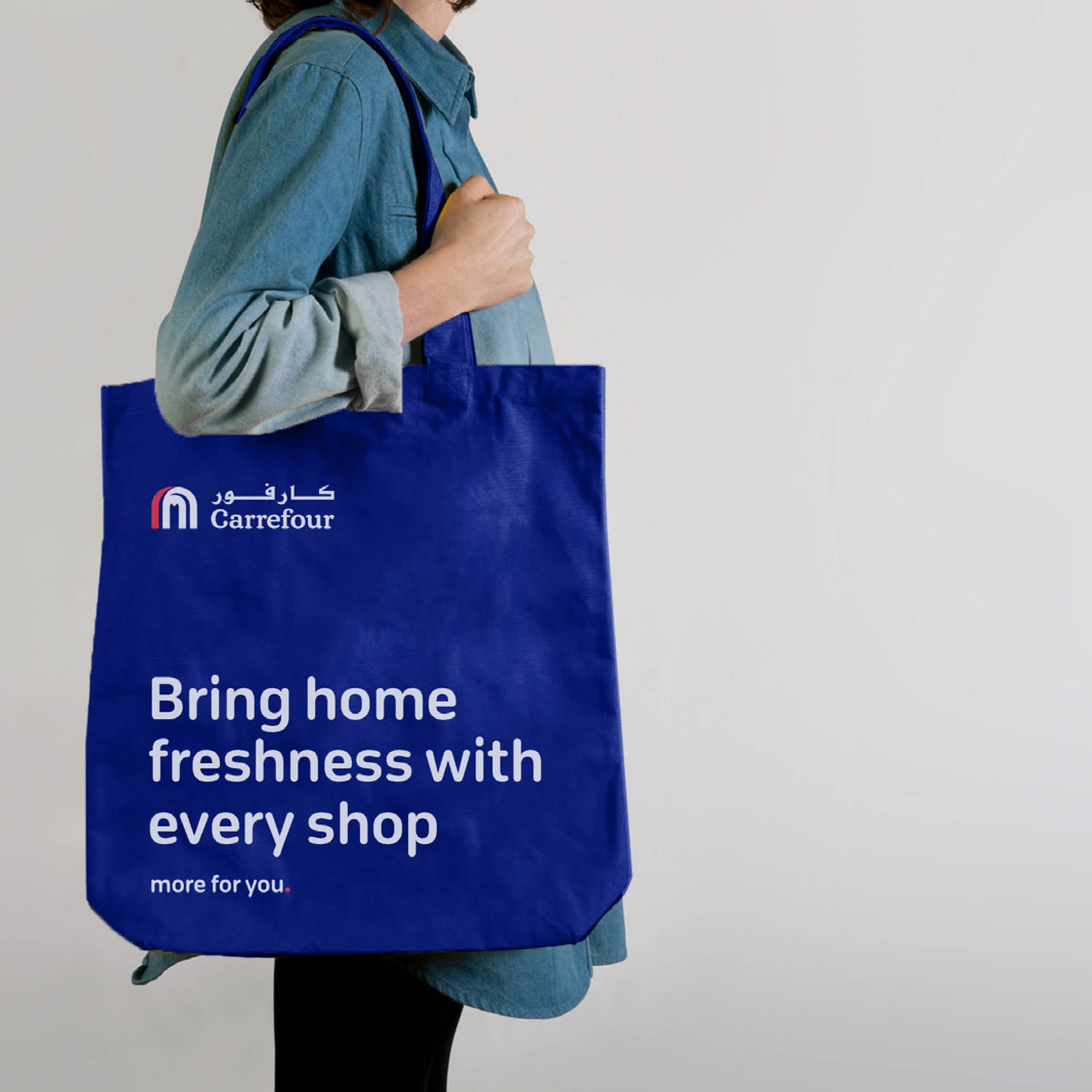
    From “low prices” to “more for you”

    Consumer behaviour was shifting across the Middle East and globally. Carrefour needed to reassess the relevance of its proposition against these changes—moving beyond a price-only stance to a broader, customer-value promise that could sustain leadership and growth.

    We partnered with a research firm to map core behavioural shifts and motivations, identifying key shopper segments and their future trajectory. Using these insights, we developed brand propositions, tested them with Carrefour leadership and in market, refining based on evidence. With a direction set, we created design systems for store, communication and livery, piloted them in select locations, gathered feedback, and iterated. Final rollout was supported by comprehensive brand guidelines that captured the narrative for change and specified the system for consistent execution.

    A refreshed value proposition anchored in everyday value, not just price. We simplified the in-store experience so offers are easier to find and benefits are explicit, and introduced a direct, customer-first messaging framework applied across channels, stores and fleet, unifying visual language, signage and livery into one coherent system.

    Market research & consumer insights
    Brand proposition development
    Messaging framework & visual language
    In-store & signage system
    Brand livery & rollout guidelines

    Carrefour shifted from a price-driven offer to a “more for you” promise, boosting customer engagement and reinforcing long-term market leadership.