Industry: SME

  • xCube Access

    xCube Access

    xCube Access

    From market access to growth advisory

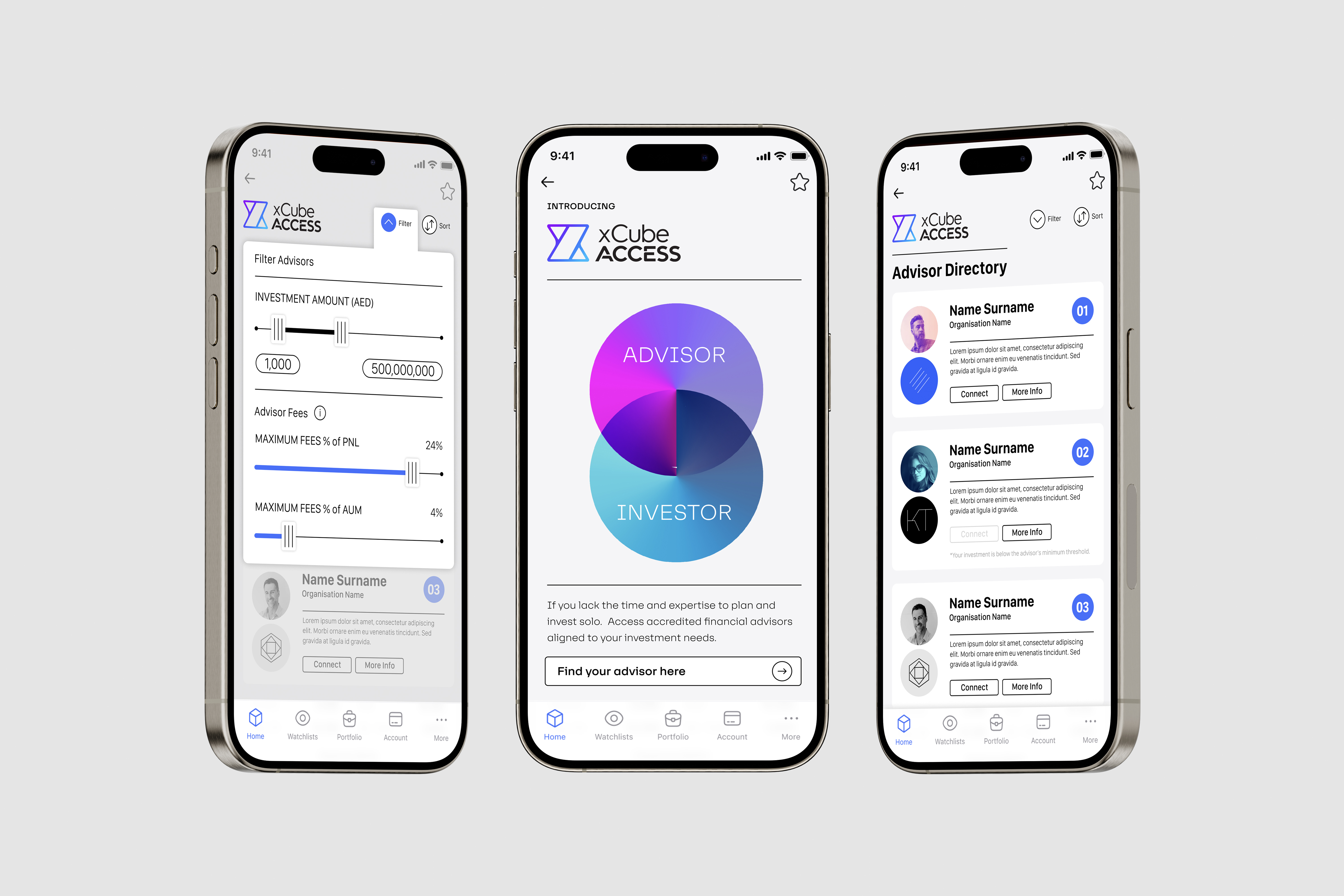
    As part of xCubes vision to improve the overall competitiveness of capital markets in Dubai, the company created a new advisory platform for the market. The platform connected advisors and investors, providing both with optimal opportunities for growth. The new brand need to represent the growing ecosystem at xCube whilst being relevant to the new offers target audience.

    We worked with the leadership team of xCube to develop brand propositions that explored the extension of the xCube brand whilst building a credible and relevant offer for the advisory platforms target audience. The propositions explored the use and extension of the xCube name, brand identity and specific personality, positioning and messaging for the new brand. 

    We landed at the optimal solution, developing a name, unique brand identity and messaging house that laid an agile platform for the launch of xCube Access to the advisory community and then later to the investor community. 

    Brand Positioning
    Brand name 
    Brand Identity
    Visual System
    Company prospectus

  • Ignyte

    Ignyte

    Ignyte

    From startup platform to global growth partner.

    Ignyte needed a brand that matched its ambition: to be more than a platform, to be a global growth partner for startups. The challenge was to create a brand that captured the spark of bold ideas while inspiring trust, scale, and impact.

    We partnered with Ignyte’s leadership to align the brand with their vision for the future of business. Through workshops and iterative collaboration, we refined the story, positioning, and identity to communicate clarity, creativity, and confidence. Together, we crafted a narrative and visual identity to connect with founders locally, regionally and globally.

    We created a clear story and confident brand identity that captures the spark of bold ideas and the ambition and vision of founders and startups. The brand is dynamic, combing technology greys with inspiring brighter yellows that demonstrate the dynamic nature of business and the aspiration of entrepreneurs. As with the business of the future, the brand is agile and versatile, easily adapting to different content requirements.

    Brand Positioning
    Brand Identity
    Brand Sonic
    Messaging Framework
    Brand Guidelines

    Ignyte relaunched with a brand that speaks to ambition and possibility:

    The future of business is;
    Empowering.

    Innovative.

    Transformational.

    Exponential.

    The future is here.

  • Leap

    Leap

    Leap

    From financial services to startup community

    The brand had to achieve two key objectives; appeal to the startup and founders community and support DIFC’s innovation journey.

    We used Leap’s “Hyper Driven” philosophy as the anchor, then designed the brandmark, typography, colour, graphic language, tone of voice, messaging and values so every element pointed to smarter, faster, safer business growth. We kept language crisp and operational, avoiding fluff. 

    We defined Leap as “the growth platform to accelerate and scale your business smarter, faster, and safer,” with a brandmark that captures forward motion, a flexible graphic system that uses colour and movement to signal momentum, and a tone of voice that is clear, intelligent, inspiring and confident. The message house emphasises the DIFC ecosystem of capital, talent and community and the values operationalise the brand through agility, delivery, energy and inquisitiveness. 

    The future of business is;
    Hyper driven,
    Hyper innovative and
    Hyper connected
    The future is here.

    Brand positioning and narrative 

    Brandmark, typography, colour and graphic language system 

    Tone of voice guidelines and message house 

    Values and behaviours 

    Brand applications toolkit and Brand guidelines 

    Leap now has a cohesive, future-facing brand that is simple to use and consistent in market: a dynamic identity that signals acceleration, a concise voice that talks like the audience, and messages that make the DIFC community’s advantages clear. 

  • DIFC

    DIFC

    DIFC

    From financial services to economic innovator


    “Dragoman was instrumental in driving the first full re brand of DIFC since its inception in 2004. As an extension of our team, we were able to re position the centre from a traditional financial service brand to an innovation brand with the full buy in from stakeholders. Successful awareness campaign to support the repositioning of mother brand as well as sub brands was developed by Dragoman from overall creative conception, video, copy, online and print. Projects are always approached with enthusiasm, care and a focus to deliver on-time with quality. Having regional experience with similar government and semi government entities, the Dragoman team were able to understand our requirements and help us push boundaries in a respectful and considerate way”

    DIFC needed to reposition itself from a financial hub to a holistic business and lifestyle destination while maintaining relevance for large financial corporations and emerging technology firms.

    Dragoman developed a dynamic brand strategy, balancing DIFC’s corporate heritage with a forward-thinking identity that appealed to financial and technology sectors alike.

    A refreshed brand proposition, visual language, and launch campaign were developed to establish DIFC as a center of innovation and business growth.

    Brand positioning
    Brand strategy
    Brand architecture
    Brand communication 
    Brand guidelines
    Brand management

    The rebranding positioned DIFC as a future-ready financial and business hub, attracting both corporate and startup communities.

  • Quardlock

    Quardlock

    Quardlock

    Impenetrable.

    Quardlock had designed and developed the world’s most advanced offline biometric security technology and needed a brand to support their next stage of business growth and market expansion. With the digital world creating massive opportunities for business and society, it also creates risks and dangers with individuals, companies and countries as they are exposed to malicious activity such as identify theft, financial losses and industrial espionage. But if you use Quardlock’s biometric off-line security for identity verification, physical spaces, digital access and transaction authentication, you become impenetrable. 

    We worked with the Quardlock senior management and technology teams to develop the brand positioning and brand identity.

    This laid the foundation for the brand positioning. The brand tone of voice had to demonstrate solidity and be direct in the way it communicated. No fluff, to the point. We kept the brand assets simple with a view to create immediate impact and also to be adaptable to the various sectors that the technology is relevant for. We worked with the business development and management team to create messaging and a tone of voice that would aid in telling the broader story, quickly framing the threat, but very quickly move to how Quardlock provides the solution. 

    Brand positioning
    Brand strategy
    Design systems
    Brand identity
    Brand guidelines

    Sales orders grew. Investors wanted to be buy into the brand and the parterns existed after 2 years.

  • Eve List

    Eve List

    Eve List

    Equivalency.

    ——

    PROJECT OVERVIEW  

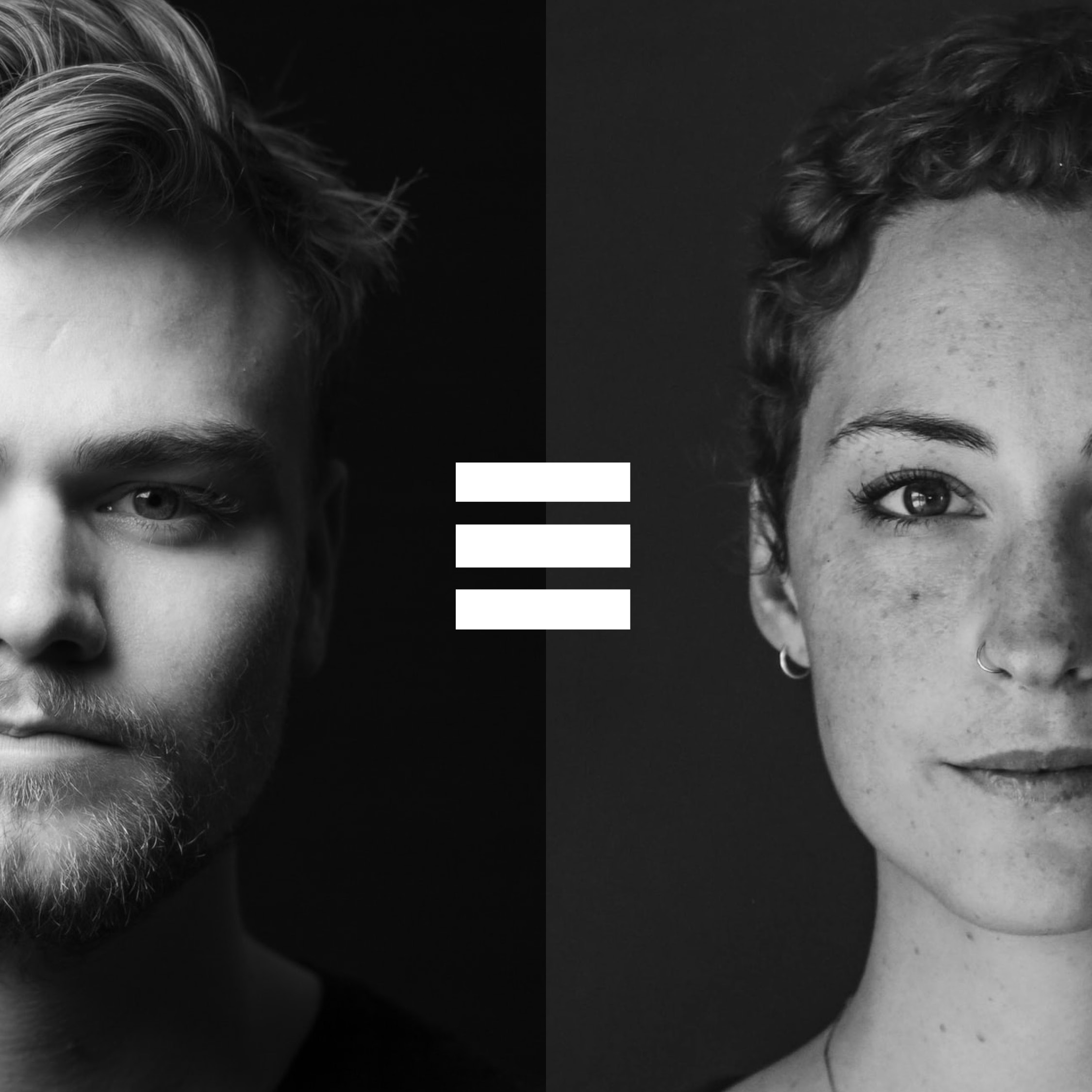
    We worked with the NGO Eve List to create a new brand to engage a broader audience and give some energy to their purpose.

    ——

    WHAT WE DID  

    We worked with the founder to really get under the skin of the issue and create a brand that could not only engage multiple audiences, but also create a platform for conversation, ultimately towards creating understanding and equivalency in our workplace environment. We are better when we are working together to solve these societal challenges and as such the brand was centred around the idea of coming together and enhancing each other. This was done through graphic symbols of +, x and ≡, an engaging and open tone of voice and a range of colours for energy.


    ——

    PROJECT DELIVERABLES

    Brand positioning
    Brand strategy
    Design systems
    Brand identity

  • IQ data

    IQ data

    IQ data

    Evolving from a wifi company to designing data solutions that transform business strategies

    ——

    PROJECT OVERVIEW

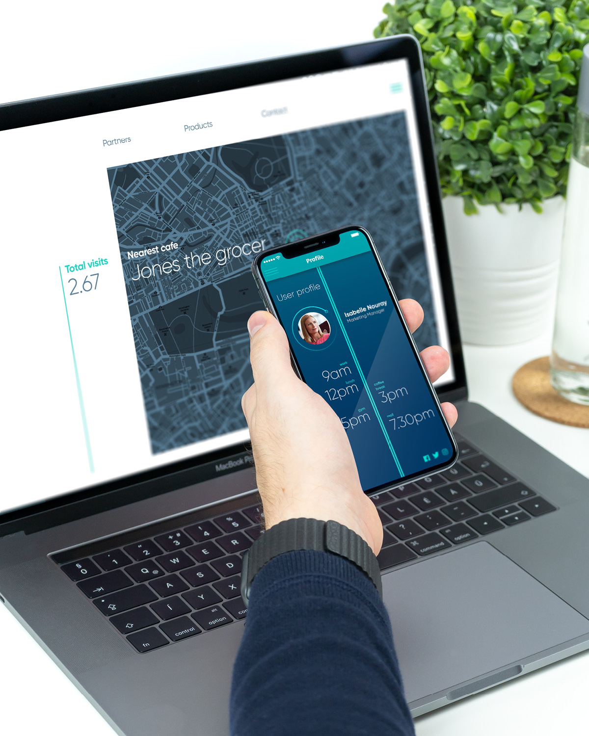
    IQ data had been in the market for a few years as IQ Wifi, a company that utilised Wi-Fi beacon technologies to help their clients better understand their customers needs and drivers. The company now had the technology and personnel to not only analyse the data from wifi solutions, but to provide its clients with a comprehensive suite of geolocation data solutions that merges the online and the offline worlds. They needed a brand that could help them take this new offer to market.

    ——

    WHAT WE DID

    We worked with the founders to not only understand the new offer and business strategy but to act as true partners, testing brand propositions and helping to focus the new narrative. Through a series of workshops we helped to identify the proposition area that retained enough of their existing market equity but created the brand proposition that would support business growth for years to come.

    We evolved the identity and developed a full visual language and design systems  for the brand to go to market. Key messaging created the right tone of voice and extended the new narrative across products and services. We then worked with their development team to map out the website journey and design the UX and UI.

    We continue to provide branding support and have created a strategic partnership with IQ data that allows us to provide data solutions for our clients and enrich our insights and customer understanding.

    ——

    PROJECT DELIVERABLES

    Brand strategy
    Naming
    Messaging
    Brand identity
    Design system
    Brand guidelines
    UX design

    ——