
Leap
From financial services to startup community
THE CHALLENGE
The brand had to achieve two key objectives; appeal to the startup and founders community and support DIFC’s innovation journey.
HOW WE WORKED
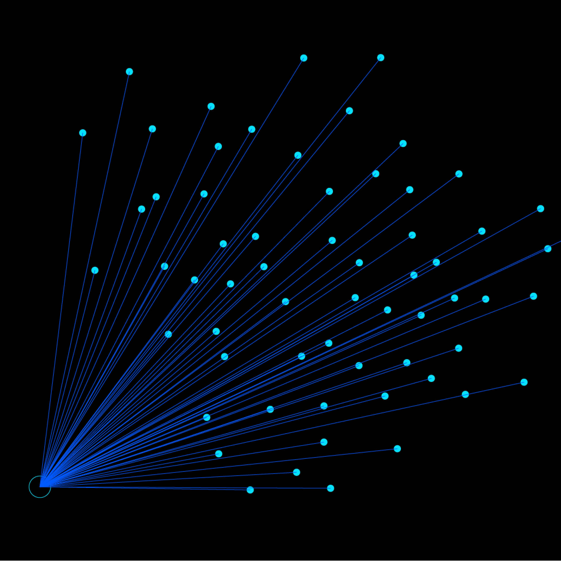
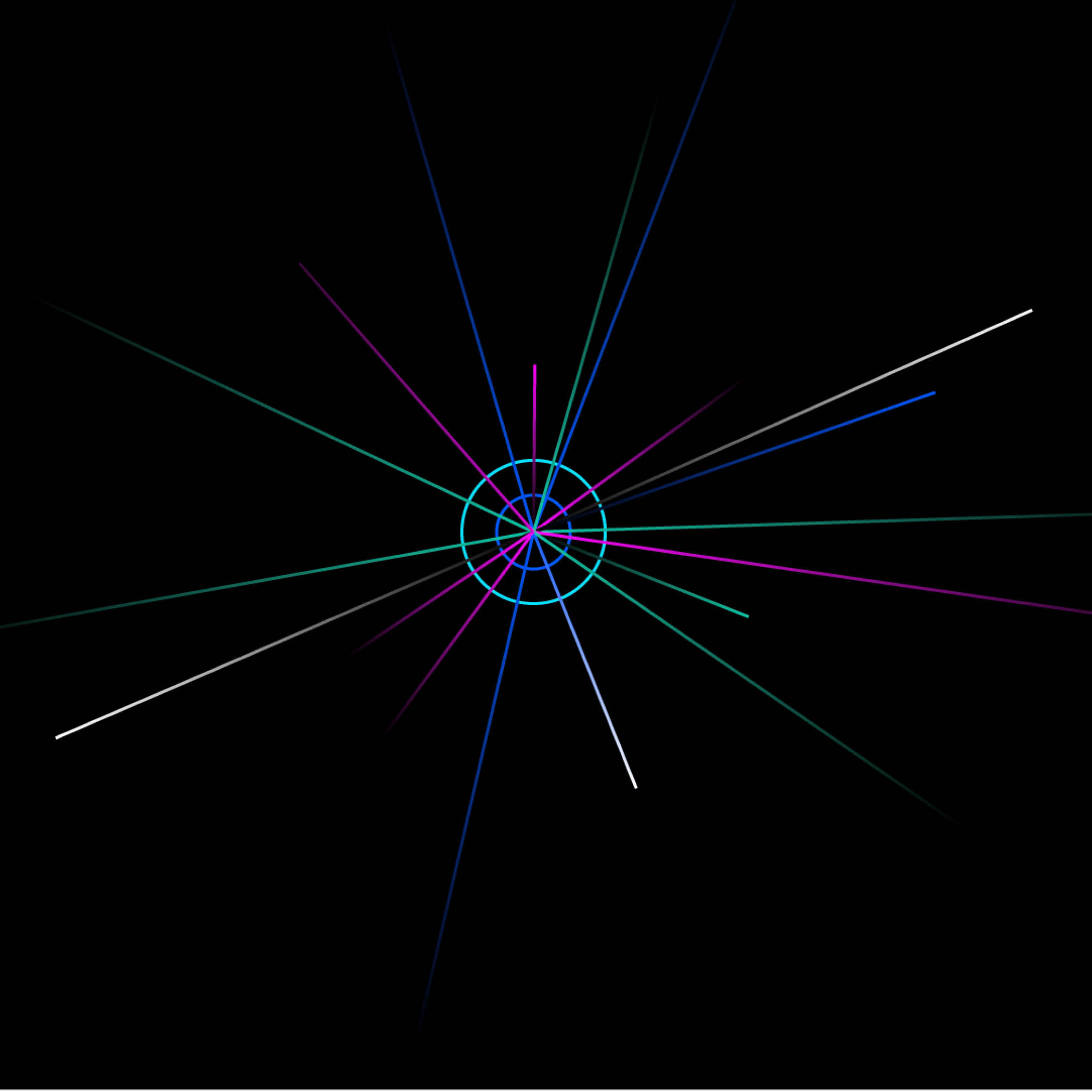
We used Leap’s “Hyper Driven” philosophy as the anchor, then designed the brandmark, typography, colour, graphic language, tone of voice, messaging and values so every element pointed to smarter, faster, safer business growth. We kept language crisp and operational, avoiding fluff.
THE SOLUTION
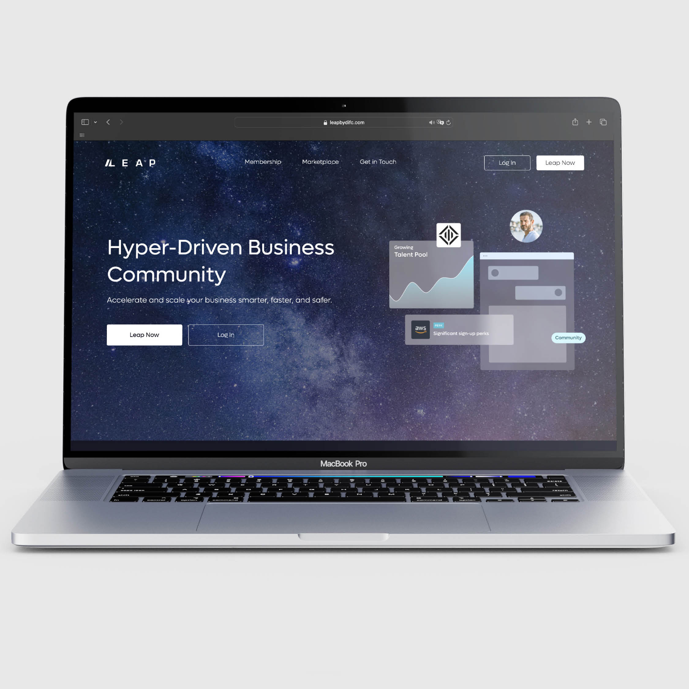
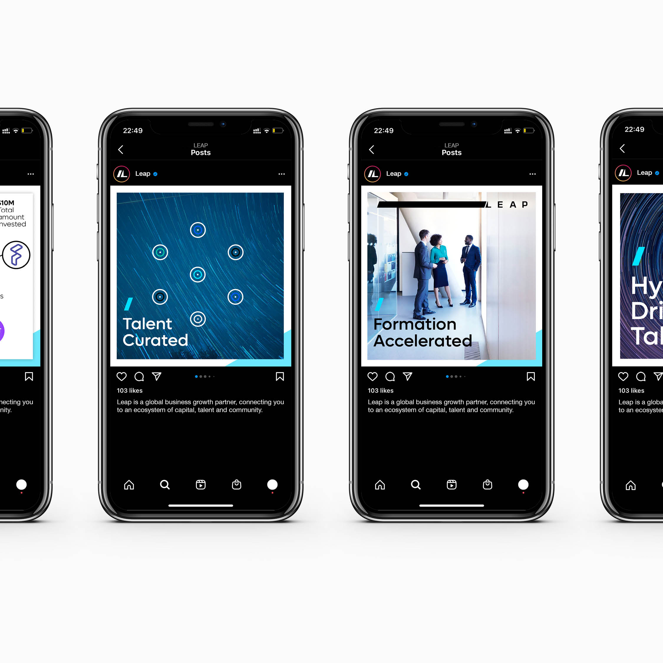
We defined Leap as “the growth platform to accelerate and scale your business smarter, faster, and safer,” with a brandmark that captures forward motion, a flexible graphic system that uses colour and movement to signal momentum, and a tone of voice that is clear, intelligent, inspiring and confident. The message house emphasises the DIFC ecosystem of capital, talent and community and the values operationalise the brand through agility, delivery, energy and inquisitiveness.
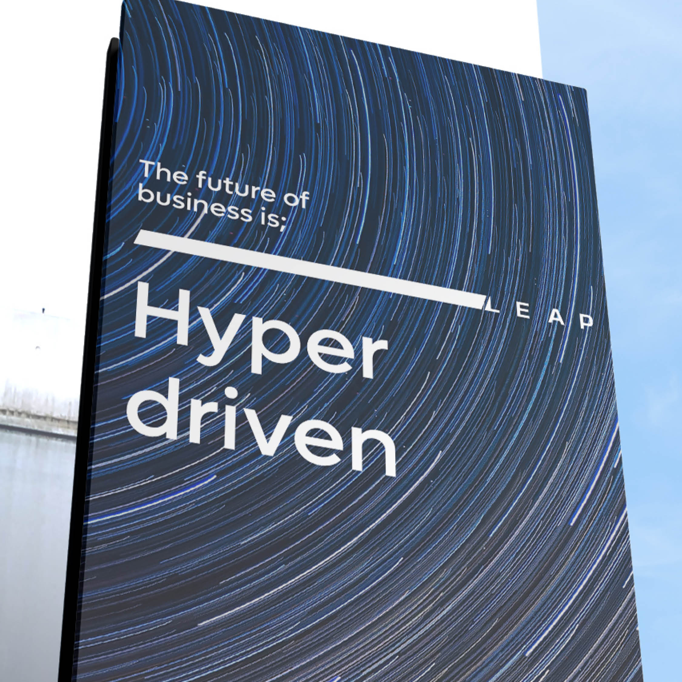
The future of business is;
Hyper driven,
Hyper innovative and
Hyper connected
The future is here.
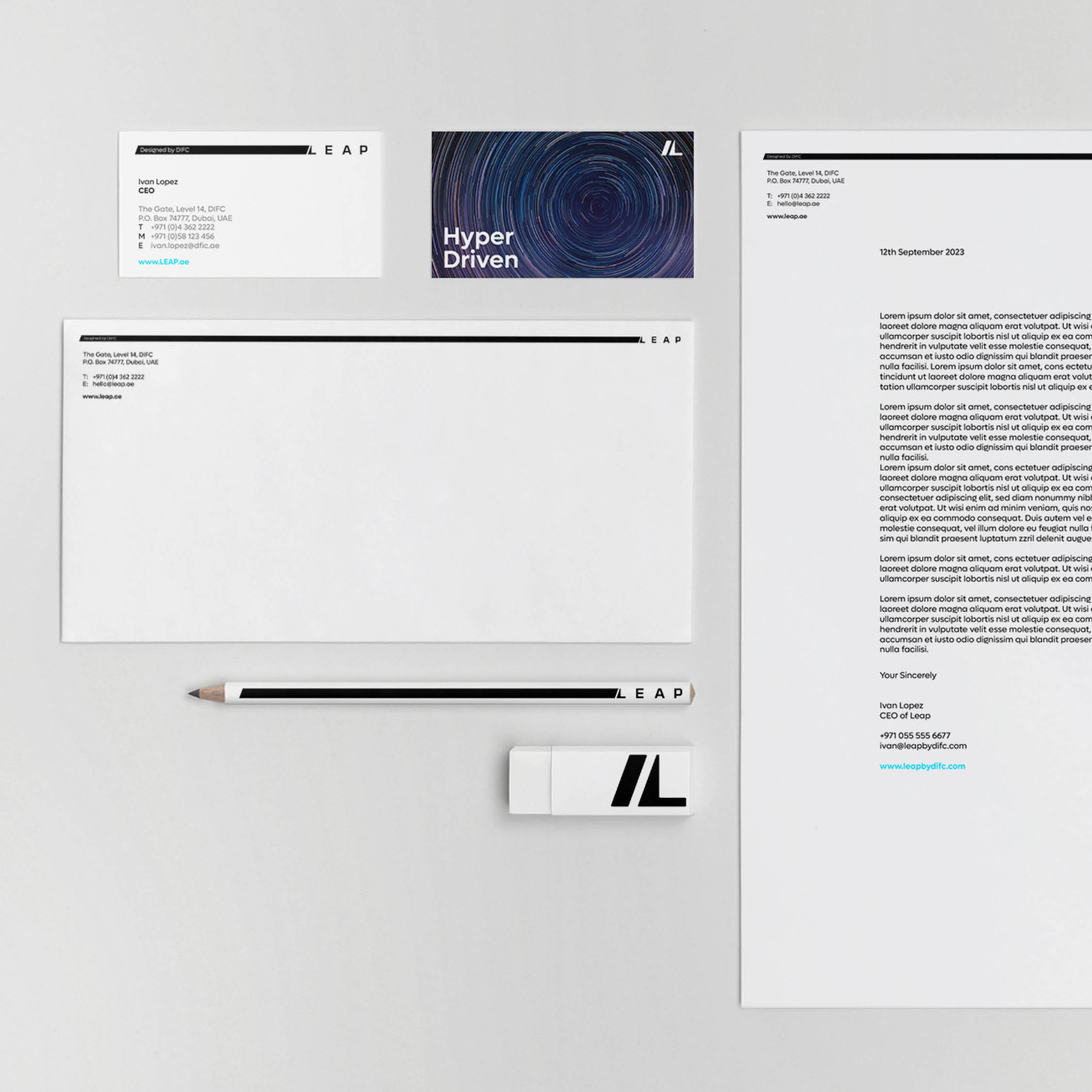
OUR DELIVERABLES
Brand positioning and narrative
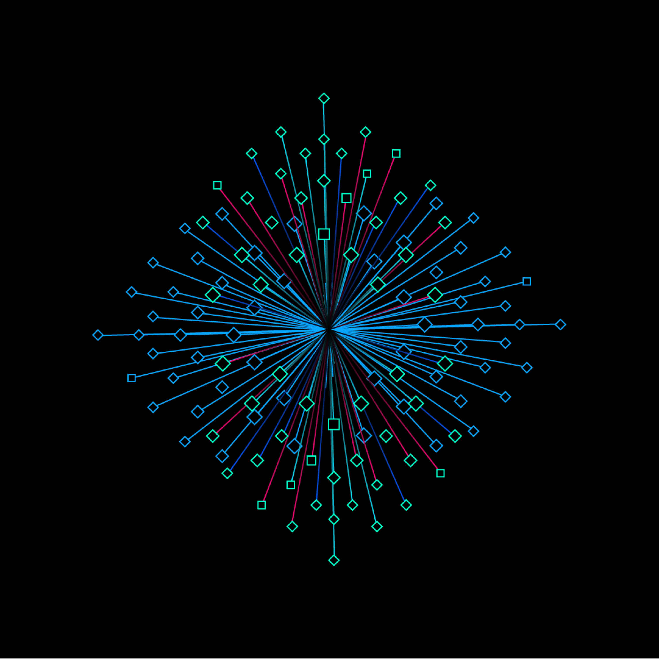
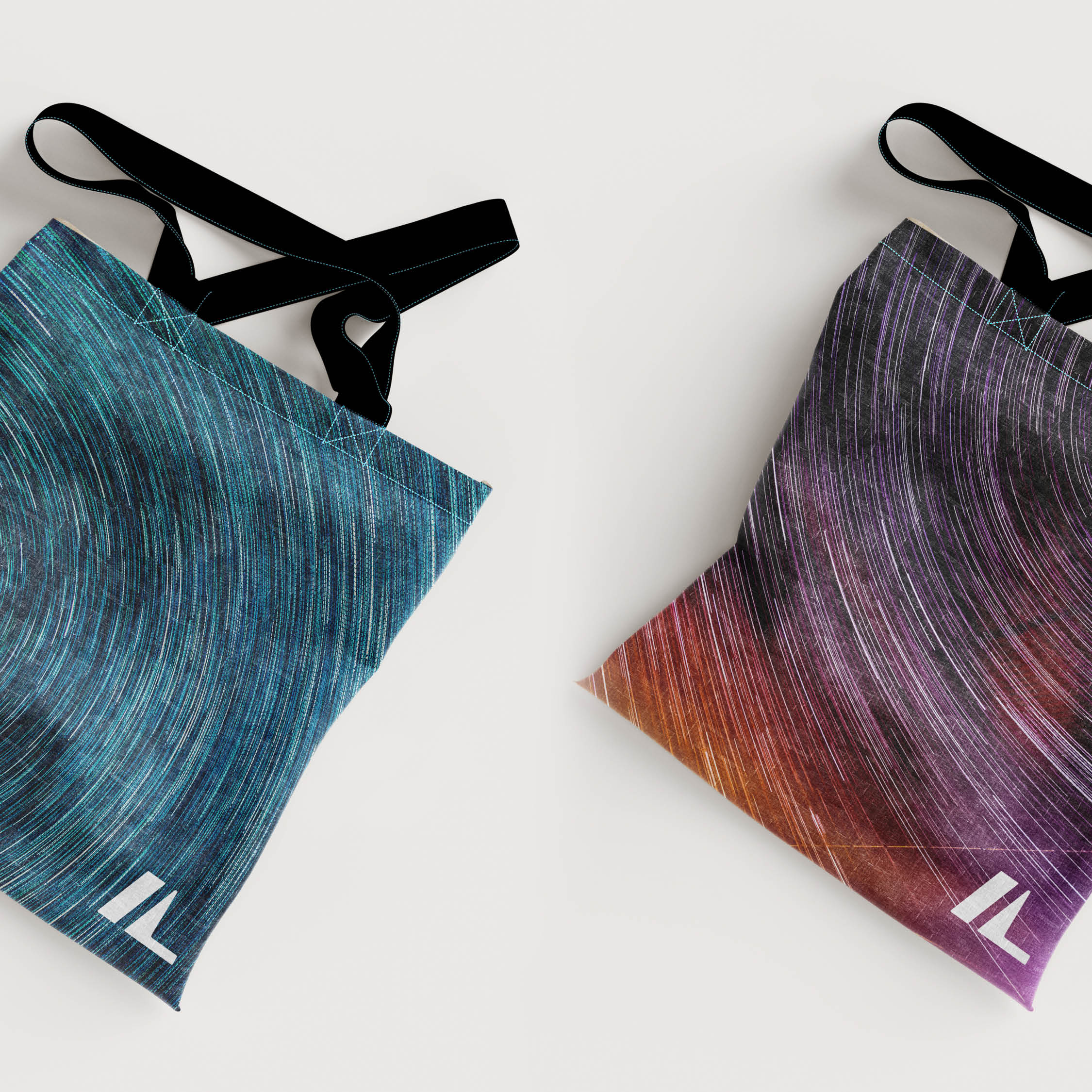
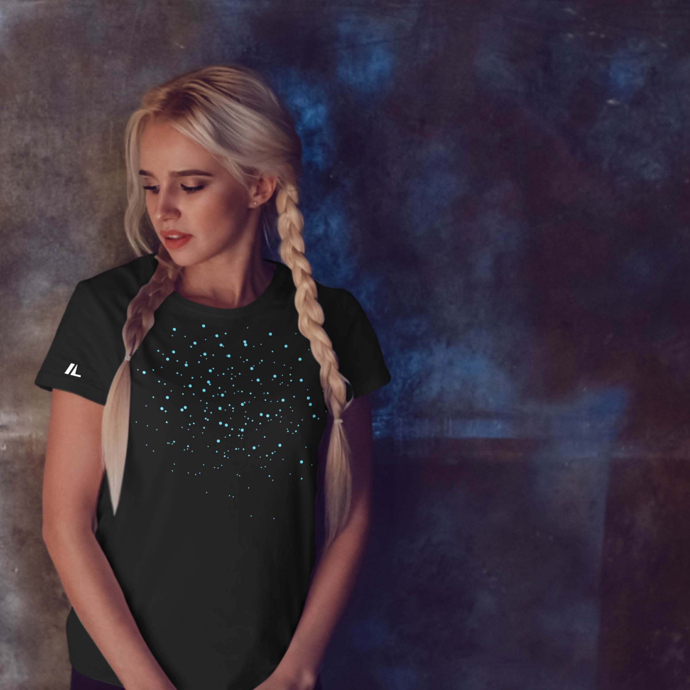
Brandmark, typography, colour and graphic language system
Tone of voice guidelines and message house
Values and behaviours
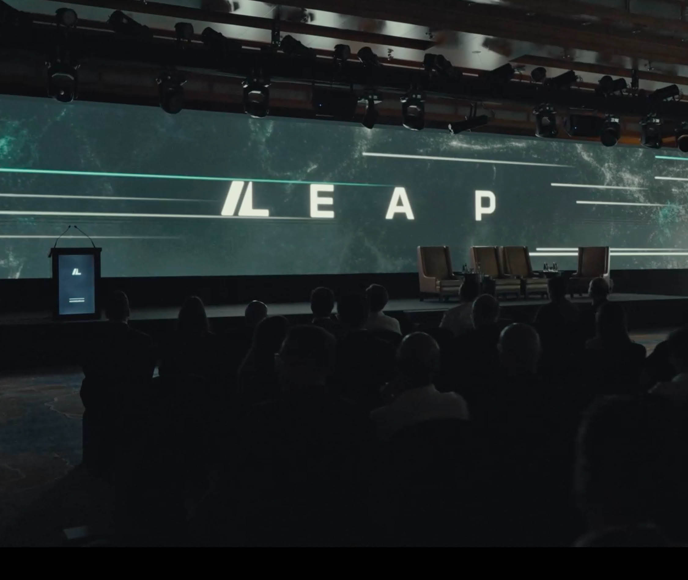
Brand applications toolkit and Brand guidelines
THE RESULTS
Leap now has a cohesive, future-facing brand that is simple to use and consistent in market: a dynamic identity that signals acceleration, a concise voice that talks like the audience, and messages that make the DIFC community’s advantages clear.